
by Ana Gotter • September 10, 2019


The Ultimate Guide to Landing Page Design
We all know the importance of a first impression, particularly at critical times. It’s why we (hopefully) proofread our resumes and job applications several times over and work to look our best for a first date that we’re excited about.
If you’re ever trying to land a big client, there’s a good chance that you go over your pitch multiple times, finding ways to stress what you can do for the client and how valuable it would be for them.
It’s a shame that businesses don’t always put the same effort into their landing pages.
A landing page is essentially a standalone page that users will see after clicking on a link from a marketing or advertising campaign. They click on a Google Ad, a link in your marketing campaign, or an affiliate link, and boom, they’re there. These pages are often created for specific purposes and even specific campaigns, like generating registers for a webinar or the sign-up for a beta test of a new program.
Because landing pages aren’t truly part of the core website and their specific nature requires that brands create a lot of them, they can be given the second class treatment. This results in poorer design, which can directly lead to failed campaigns or fewer conversions that you’d originally hoped.
Since landing page design is crucial for success and you need that landing page to convert users on an offer, it should be something that all marketers and businesses are considering more carefully. Let’s take a look at what your landing page design should be doing, some mistakes to avoid, and some key tips to help you maximize conversions.
What Your Landing Page Needs to Accomplish
The landing page is the final step in a series of actions that users need to take before select conversions, so it needs to convince them to click whatever CTA you have on the page, whether it’s to submit a lead form or to start the purchase process. This means that your landing page must give viewers all the information they need to feel comfortable with their decision to convert, it must help convince them if you haven’t already, and it should immediately make the option to convert the center focus.
Those are the three big things that your landing page needs to accomplish, but you’ll also want to have the following readily apparent on the landing page:
- A link to your company’s homepage or main site somewhere on the landing page so that people can find out more about you if they’re not comfortable just yet.
- Terms of service and privacy information, which is often found at the bottom of the landing page in small text.
- The fine print of any offers that details about what users are converting on, like if the entry-rate price was only for the first order, or how long the offer is valid until. This is almost always found immediately under the offer for liability purposes.
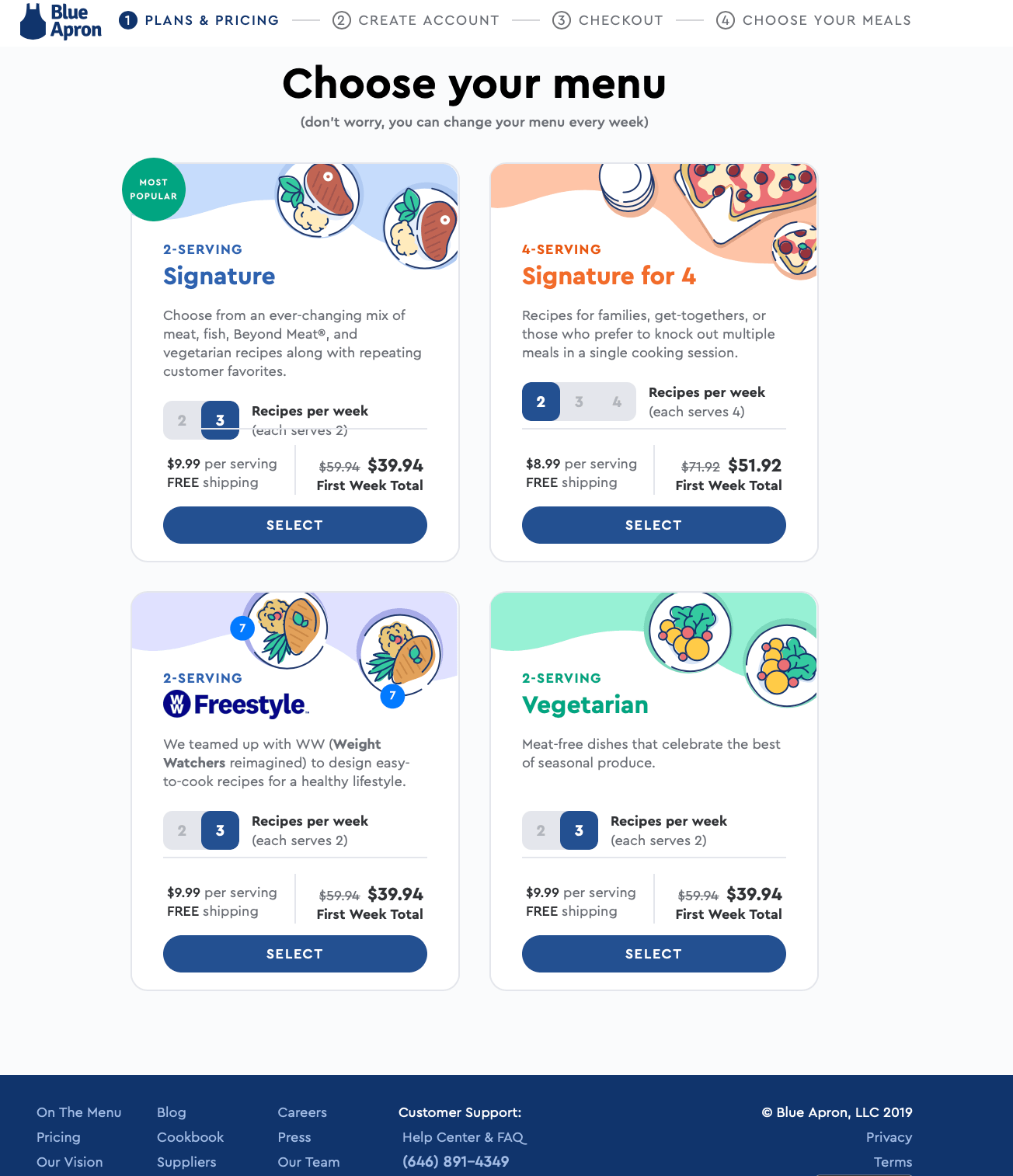
The example above from Blue Apron does all of these things well, taking users from a Google Ad for the keyword “meal box service” to this page which details what they have to offer. Users are encouraged to pick a plan by seeing the details and introductory pricing for each one, making the offers more appealing, and having all the needed information for more context linked at the bottom of the page.
9 Landing Page Design Tips to Boost Conversions
While you’re designing your landing page, remember everything that we just discussed and make sure that it somehow finds its way onto the page.
In addition to those core requirements, however, there are some design tips that can help you best present this information in a way that will appeal to page visitors and increase the likelihood that they convert on whatever offer that you have.
We’re going to look at 9 landing page design tips that will boost conversions across the board, no matter what industry you’re working in or what type of audience you’re trying to attract.
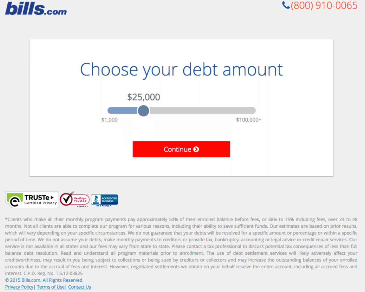
1. Place CTAs Above and Below the Fold
You want that CTA to be immediately visible at all points in time so that users can convert the second they’re ready. This means having a CTA that can be seen no matter where on the landing page users are based on how far they’ve scrolled.
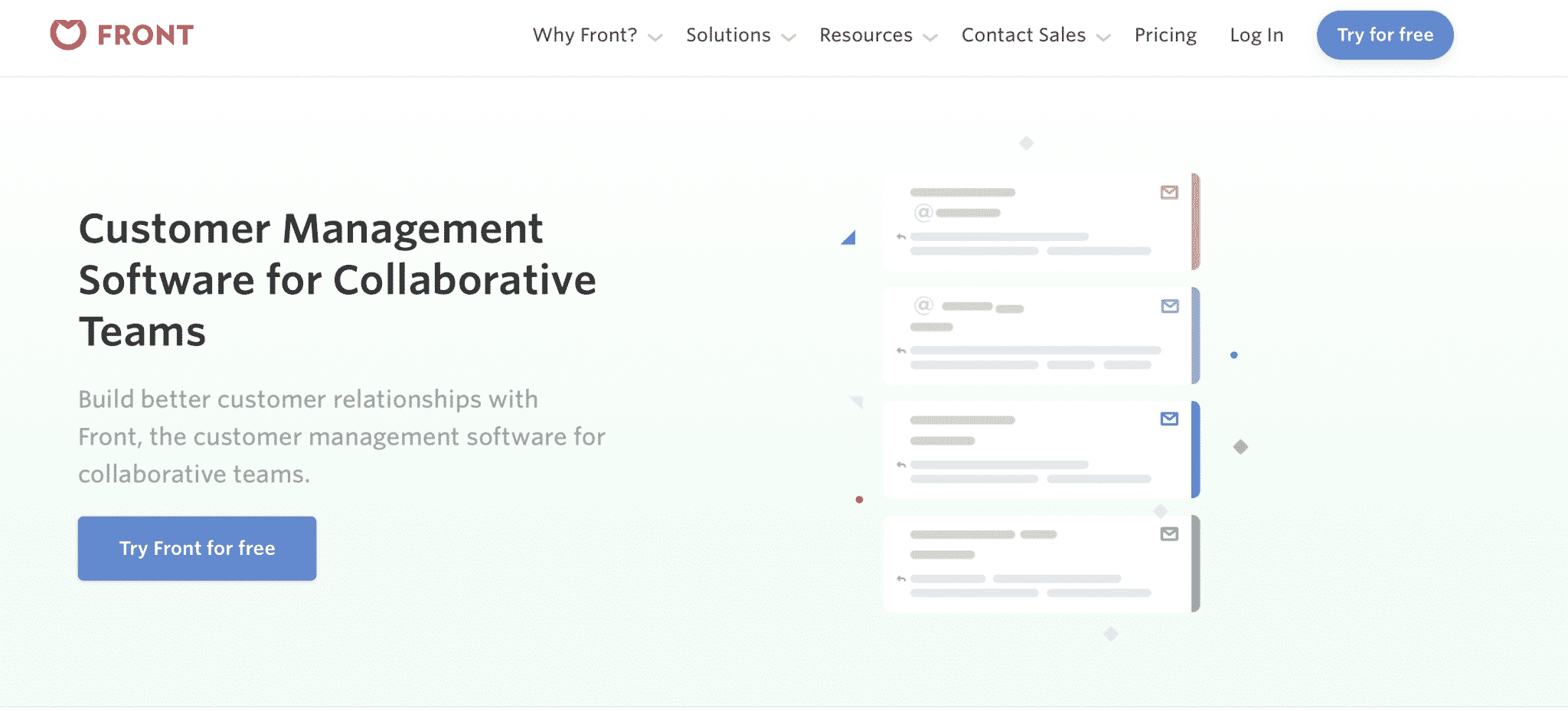
The example above does this with a CTA in the navigation bar and on the most prominent part of their landing page. Your eye goes straight to it, being encouraged to start your free trial. The landing page contains more information if you scroll more, but there’s always a CTA visible that users can click as soon as they’re convinced.
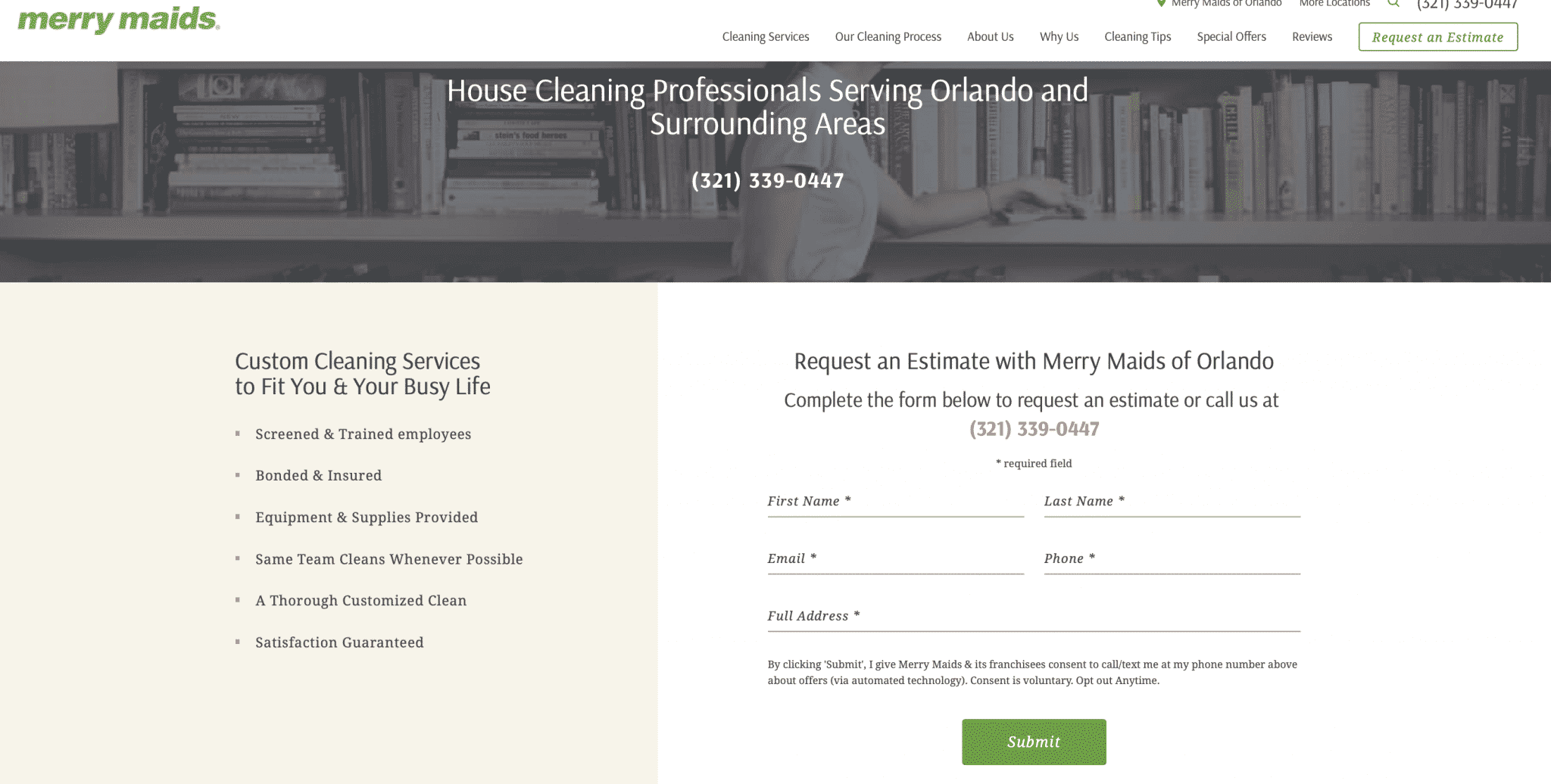
2. Opt for a Clean Design
Clean designs feel more organized, and it’s easier for users to read through them. If the landing page feels cluttered, it’s overwhelming and people will leave. You want their eye to immediately be drawn to the CTA and for them to easily find and scan any information they need. Think lots of white space and text broken down into visibly distinct sections, as if the entire landing page was built with building blocks.
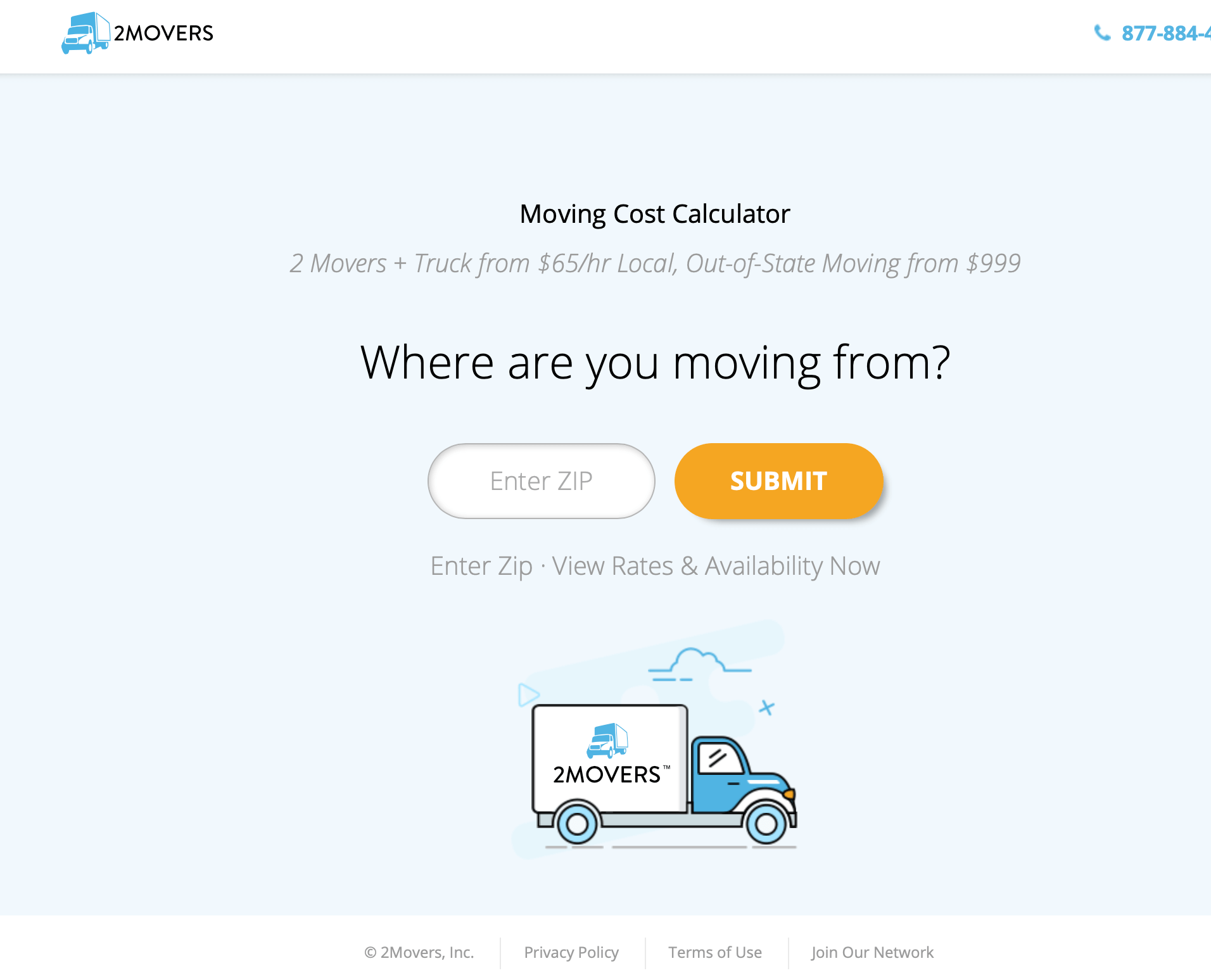
This landing page, for example, is simple but effective. It’s got the logo, the contact info, all key information linked at the bottom, and all the information the user needs to decide they do want to get more information from this company. Though many landing pages will need more info than this, it’s a good reminder about how simple you can get.
3. Always Use Color-Contrasted, Clickable CTA Buttons
Clickable CTA buttons—as opposed to just hyperlinked CTA text—will reliably increase conversions. They’re noticeable, and they look definitive: This. Is. What. You’re. Supposed. To. Do.
You want to go through the extra effort to have a CTA button on your site, and landing page creation tools like Unbounce (which we’ll look at more later on) make this easy to do.
In addition to using CTA buttons, you’ll want to make sure that said button is a contrasting color from the rest of the site and text. This brings the eye in immediately, and having a large, contrasting button is the way to go. You can use this color to highlight one or two other key areas you’d like users to click on the site, but make sure that all CTAs match in color, text, and size.
Common CTA button colors include yellow, orange, and green, but it all depends on your brand and the colors your site is already using.
4. Include Bullet Point Lists of Benefits
Bullet lists are going to be your best friend on landing pages. They allow you to quickly convey benefits or features of your product or service that come included with the offer, and allow you to really push your unique selling proposition (USP). This information is easily-digestible, and it can be what you need to persuade users to convert.
If you’re trying to create a landing page that will be used for several different campaigns, bullet lists can also be used to incorporate the appeals you’re featured in each individual campaign all in one place without feeling overwhelming. This makes your page relevant to every single user who clicks, no matter which campaign they’re clicking on.
5. Make the Fine Print Actually Visible
When you’re considering landing page design, the text you choose to incorporate matters, too. That includes the fine print that details what exactly your offer does and doesn’t include.
A lot of brands will try to place the fine print behind a small hyperlinked text listing “details,” but having those details apparent under the offer (and often under the CTA) is a good call. It prevents misunderstands and feelings more transparent, and the latter matters just as much as the first. The text can be really small—that’s fair game—but it should be readable.
6. Use Well-Placed Microcopy
Microcopy isn’t something that you always see on landing pages, but it can absolutely be used to help establish your brand and get you closer to conversion.
Microcopy is small sections of text that provide key information and push users towards a specific action. They often heavily utilize your brand voice to do this, speaking to your audience directly.
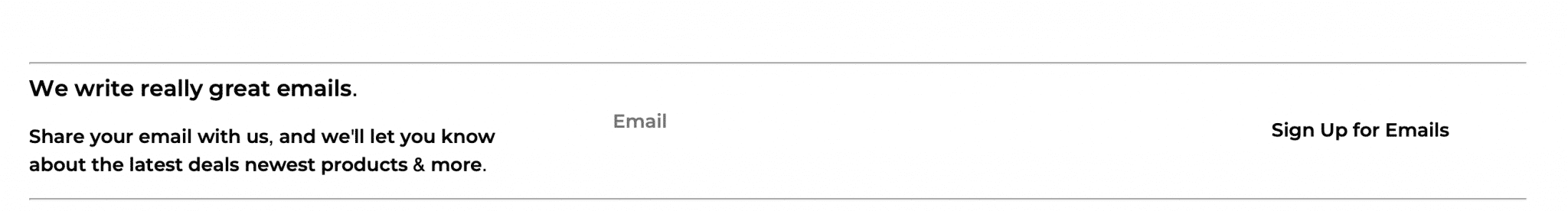
This example isn’t from a landing page, but it’s still a good example of microcopy used to encourage users to sign up for the email newsletter. You can use microcopy to send users to other places on your site if they aren’t ready to convert, or to elaborate on the value of the offer you’re presenting.
7. Choose An Image or Video That Highlights Your USP
The visual components of your landing page are, of course, an important part of the landing page design.
The visuals you choose will depend heavily on your brand, but here are a few best tips:
- Opt for high-resolution images or short, digestible videos that clearly demonstrate the value of what you’re offering.
- Place the image or video towards the very top of the landing page, either stretched thin like a banner at the top or off to one side so people can still see the CTA clearly.
- Test different images and videos, and make sure they work well with the established color scheme and branded colors that are already existing in your landing page design.
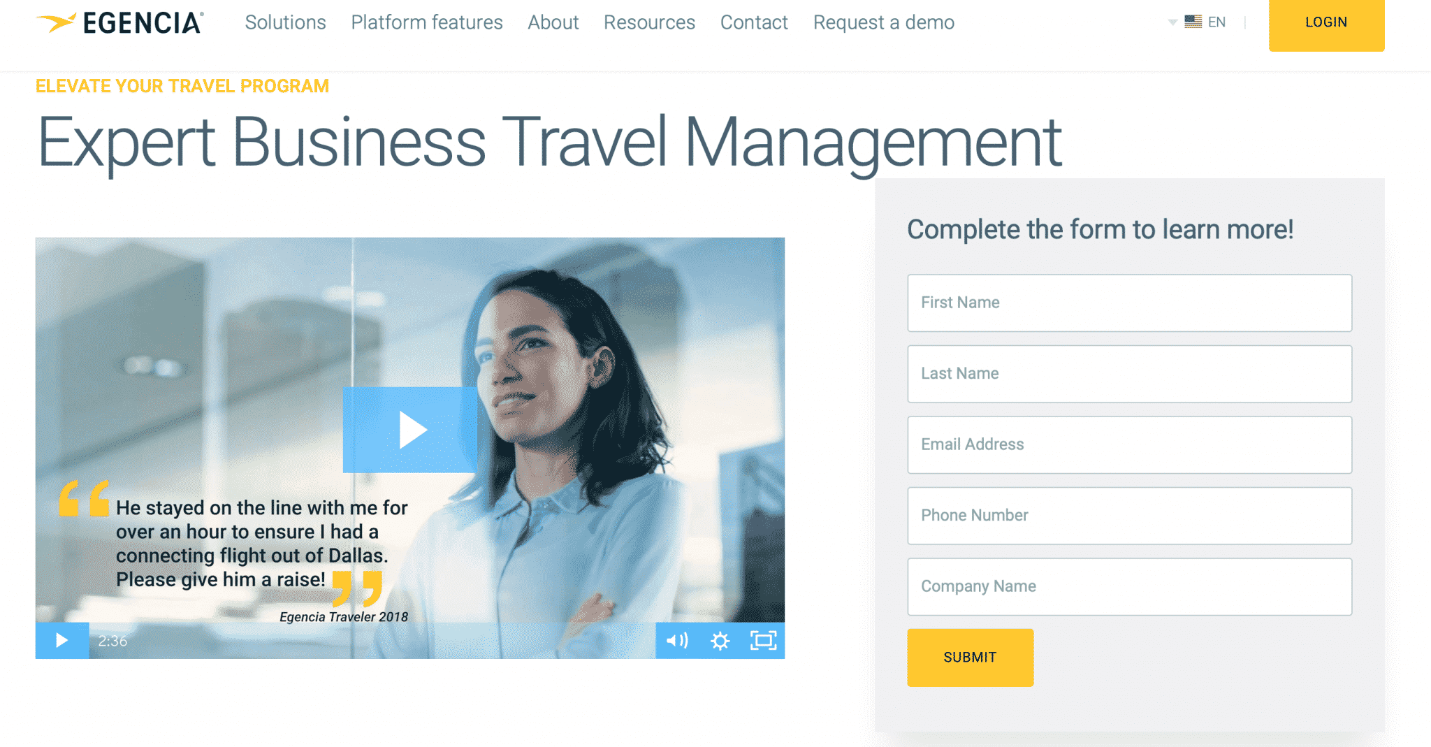
8. Don’t Ask Too Much
You don’t want to ask users to do too much or to make the process feel overwhelming.
The online dating site eharmony, for example, has an extensive questionnaire that puts off some users who originally wanted to sign up for the service. While I don’t think is terrible, because if you aren’t ready to spend 15 minutes answering basic questions it likely means you aren’t ready to find marriage, it still serves as a powerful reminder: asking for too much will lose a significant chunk of your audience.
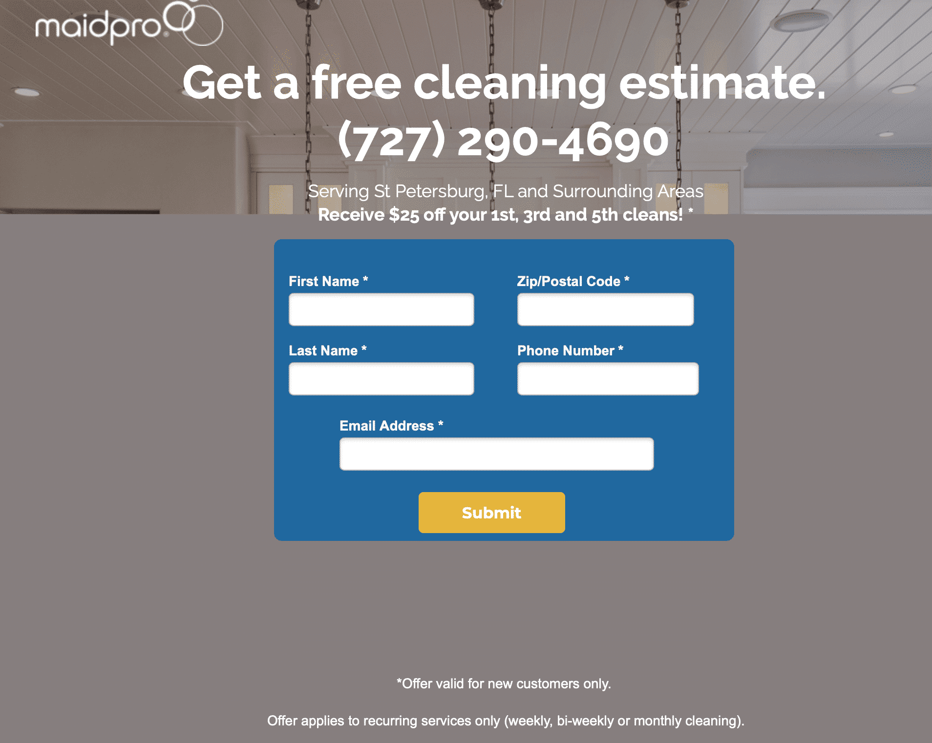
You’ll see this most often with landing pages that feature lead forms. Some are so insanely long that users need to scroll down half a page to continue filling it out. It’s too much, and it results in loss of conversions. Try to stick to the basics, like name, zip code (if relevant), and email. For select services, you can add in a phone number or a question or two to qualify the lead.
9. Test, Test, Test, And Then Test Some More
Thorough testing is important, even once your campaign is live. Many advertisers remember to test their ads but forget about their landing page altogether, which is the last thing that you need to do. Testing different designs—including layouts, images, and the copy on the landing page—is an important part of the process when it comes to maximizing conversions.
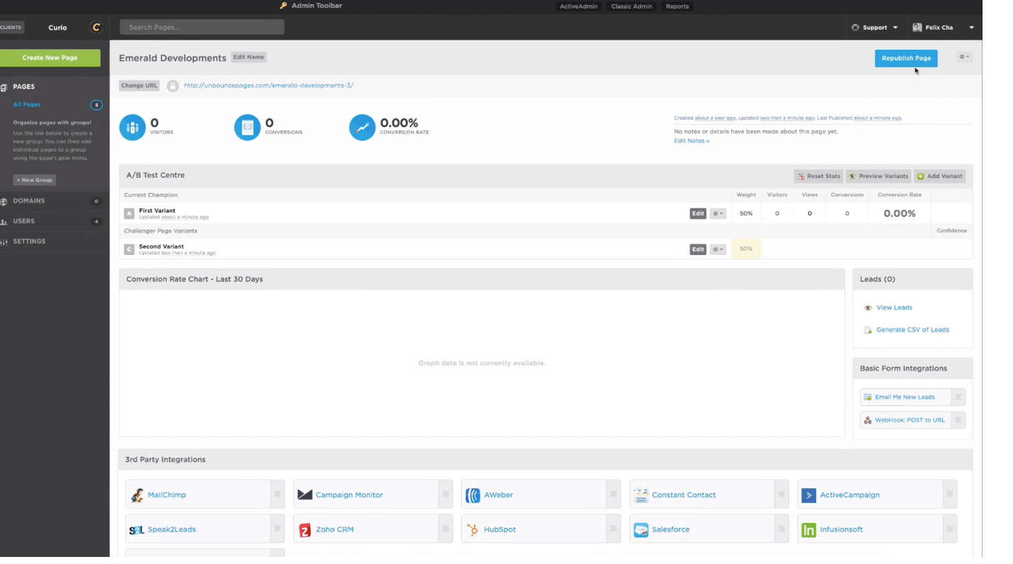
While this sounds exhausting, fortunately, there are tools that make this process easy. Unbounce is an incredible landing page creation tool that utilizes drag-and-drop software so that you can build beautiful, functional landing pages with no coding or design experience needed.
They also have a split-testing feature so you can test different variations of the same landing page to see what yields the most conversions without needing to run duplicate ad campaigns. You can designate what variable you want to change, adjust it accordingly, and split the traffic 50/50 (or in any percentages you’d like) to see what works.
3 Common Landing Page Design Mistakes to Avoid
All of the tips above are strong best practices that you should follow, and frankly, failing to follow most of them could be considered a mistake. That being said, here are 3 common landing page design mistakes that you do want to avoid:
- Treating the landing page as a truly isolated page. Some users who get to your landing page will know a ton about your business already. Maybe they’re blog or email subscribers, or follow you on social media. It’s so important to remember, though, that some landing pages are designed to capture users who clicked on an ad and only know 45 characters worth of information about you. Make sure that page viewers can view the rest of your site to get the information they need.
- Failing to test your landing page. We talked about the importance of this above, but failing to test is such a common mistake we wanted to mention it again. With those tools like Unbounce that make landing page testing so easy, there’s no reason not to do it. And yes, you should be testing design in addition to copy and the images that you use.
- Not aligning the landing page to the specific message that got users there. If you’re running an ad focusing on the affordability of your service and your landing page is all about the premium customer experience and doesn’t even mention price, there’s a low chance of conversion. This is more of a copy tip than a design tip, but consider what images, messaging, and offers you used to get users to your page. Make sure that it all feels seamless, even if that means creating additional landing pages.
Final Thoughts
When most advertisers are creating their campaigns, they’re focusing almost exclusively on the ads themselves and often neglect to prioritize and test the landing page, too. This may because it’s difficult to convince some clients that the landing page needs to be strategic and well-tested, too, but it’s easy to think that the right email, ad, or marketing message will automatically trigger conversions no matter what comes next.
While the right messaging can definitely inspire users to convert, a weak landing page can also stop them dead in their tracks, which is the last thing that you want. Prioritize your landing pages accordingly when creating your marketing funnel, and remember that it’s the last step you need to get users to take before conversion, and it’s your last chance to convince them to do so.
Need help testing your landing page or optimizing the campaigns you’re using to get traffic to it? Send us a message and find out how we can help.
What do you think? What landing page design tips have you prioritized in the past, and which will you use moving forward? Share your thoughts, knowledge, and questions in the comments section below!


