
How to Style Great Instagram Layouts For Your Business
by Cydney Hatch


What does your Instagram layout look like?
Be honest…
There are only two ways this can typically go, you either have a unified aesthetic experience or you have a mess that leaves people wondering what your Instagram account is about.
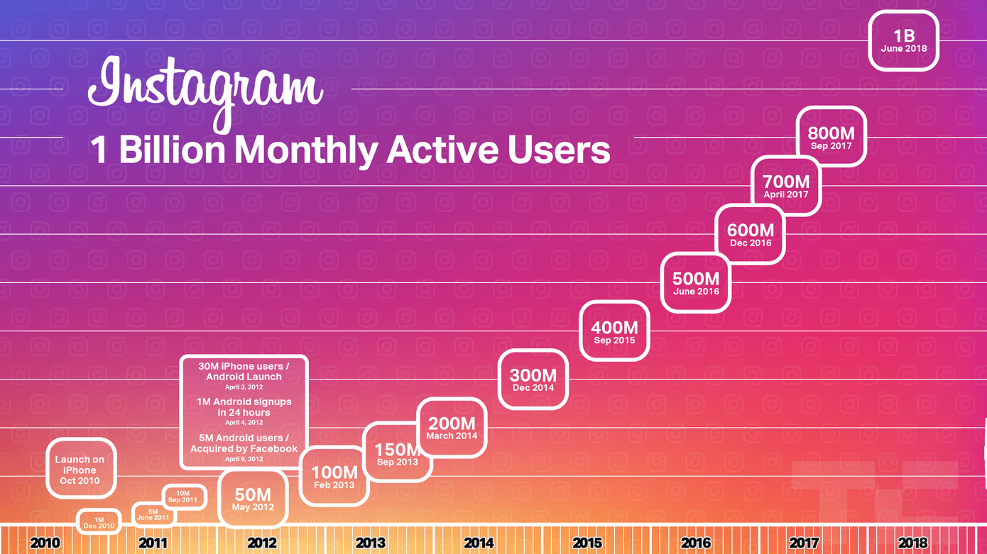
Since the platform was created for photos, visual appeal is one of the key factors in making or breaking your Instagram success let alone your first impression to viewers. With Instagram hitting 1 billion monthly users just last year, this is one of the major platforms you don’t want to mess up on!
So, want to learn how to visually appeal to your target audience on Instagram?
Great!
In this article, we will give you all the tips and tricks to make for a great looking Instagram account that attracts new followers focusing on your layout! Whether your account is drab or you just need a slight facelift, this article has you covered.
Let’s grid it out together!
What are Instagram Layout Grids?
Your Instagram layout grid is the feed of visuals your account shares with the Instagram platform. S0, whether it is pictures of your Instagram famous dog, motivational quotes or product photos your Instagram grid is the visual way you represent your business, brand or products.
Sure, you may have mastered the art of filters, but don’t think that is the only thing that matters! The entirety of your visual grid is more important than individual posts as it is where all the juicy parts of your profile are holistically, including your follow and message buttons.
So, looking at your Instagram layout grid currently, what is it saying about your brand? (take a moment to truly take notes on what you like, what you need to improve and what you might be interested in learning more about).
In the next sections, we will talk about everything you can consider in making your layout look better!
Why You Should Plan an Instagram Layout Grid
So, you might be thinking, “My Instagram layout gets the job done for now”, but this is not the attitude you should have.
“Getting by” and “getting the job done” are a great place to start, but with a curated layout grid you can see greater results due to better marketing tactics and visual acceptance from customers. If you need more reason than that, let’s take a look at some of the other benefits a well-curated Instagram could bring to your business:
Great First Impression and Actions
Unfortunately, you only have a few seconds to grab the attention of potential customers on social media these days so your initial impression will be crucial for further engagement.
When a person opens your account a few rapid-fire decisions are made:
- Are they going to read your bio?
- Are they going to click the URL link?
- Are they going to follow you?
- Are they going to dig through your content to learn more?
- Are they going to comment or like your images?
Are you helping them take action by planning your visuals? I sure hope so!
These decisions all depend on how your profile is designed. So you need to honestly ask yourself: Was your layout grid created intentionally as a whole cohesive structure, specifically designed to keep interests, follows and people interested?
If so, you will see better results because people can understand quickly what your account is about and they are interested in learning more!
Better Brand Aesthetic
Your Instagram layout grid is the collection of brand experience you want potential customers to take away. Developing a strong visual brand strategy is the key to setting yourself apart from your competitors and helping your business grow.
People will come to know your brand through this aesthetic, so you need to make sure you put time and effort into planning it! By doing this, you can easily collect people who love your brand and want to share it with others.
A Good Grid Makes Posting Easier
When you plan your grid layout, you force yourself to think of branding and marketing first, which is so important when it comes to social media marketing.
Instead of throwing up jumbled pictures to hit the mark of being “socially active,” being methodical with your content posting allows you to make better flow and sense of the story you are trying to tell your target audience!
By planning ahead you help streamline your posting process to be more effective!
So, if you are thinking you need to redesign or rethink your Instagram visual game, let’s take a look at different ways you can plan your Instagram grid layout for the better!
What Makes for a Great Instagram Grid Layout?
Before we jump into some visual displays to consider, I first want to go over some of the basics that make for a great Instagram account experience. Because before you can get creative, you must understand the basics so you can bend the rules for your brand!
So, to start, here are some of the basics that make for a great Instagram grid layout:
- High-Quality Images: no one wants to see pixelated images on an Instagram grid, so make sure your photos are crisp, branded and high-quality. This is a MUST! (note they do not need to contain professional models or studios—they just need to be done well).
- Photo-Consistency: This is simple, you want to keep your photos consistent. Decide if your grid will be minimal, colorful, or any other aesthetic that ties to your brand. Once you pick, stick to it, unless otherwise carefully planned for (this also depends on your industry standards).
- Image Editing Filter Consistency: It is not just the photo arrangements that matter, be sure to use the same filter on every post. This makes your posts recognizable and consistent.
- Set a Color Scheme/Palette: To be successful, decide on a color scheme you’ll use for all of your posts. Think of your brand color palette and think about how you can make that consistent across your social media pages and website.
- Keep Things Simple: Like most things in the visual arts, unless the chaos is organized, you do not want to include anything that will take away from the subject of your photo—stick to solid backgrounds when posting product shots.
- Set a Grid Content Pattern: When you post weekly, you want to consider the different types of content and images you will want to post. This makes your grid look good, creates a nice “flow” between posts, and keeps things consistent.
Taking these principles into a real-life application, let’s take a look at two account examples:
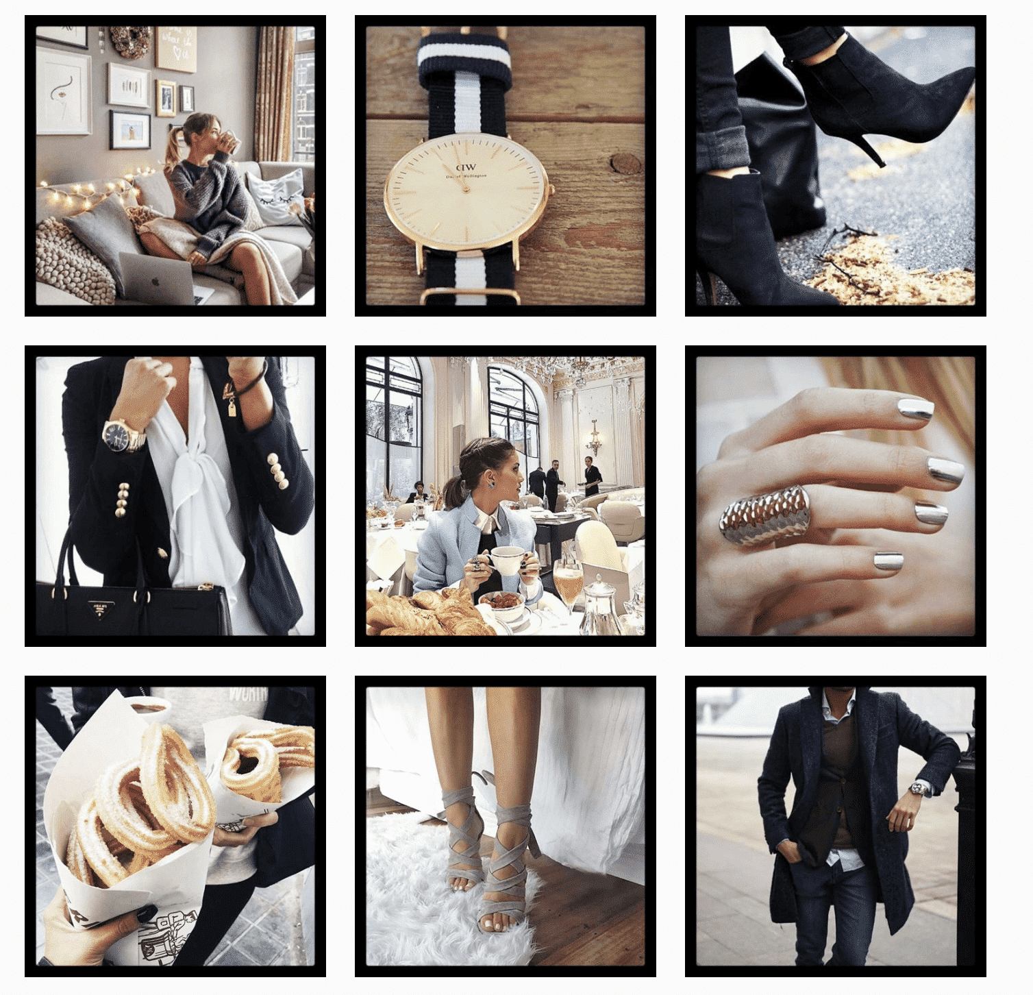
We have all scrolled through social media and recognized a brand from their images without even reading the name of the account. This is not by chance, it is intentional—and excellent business branding!
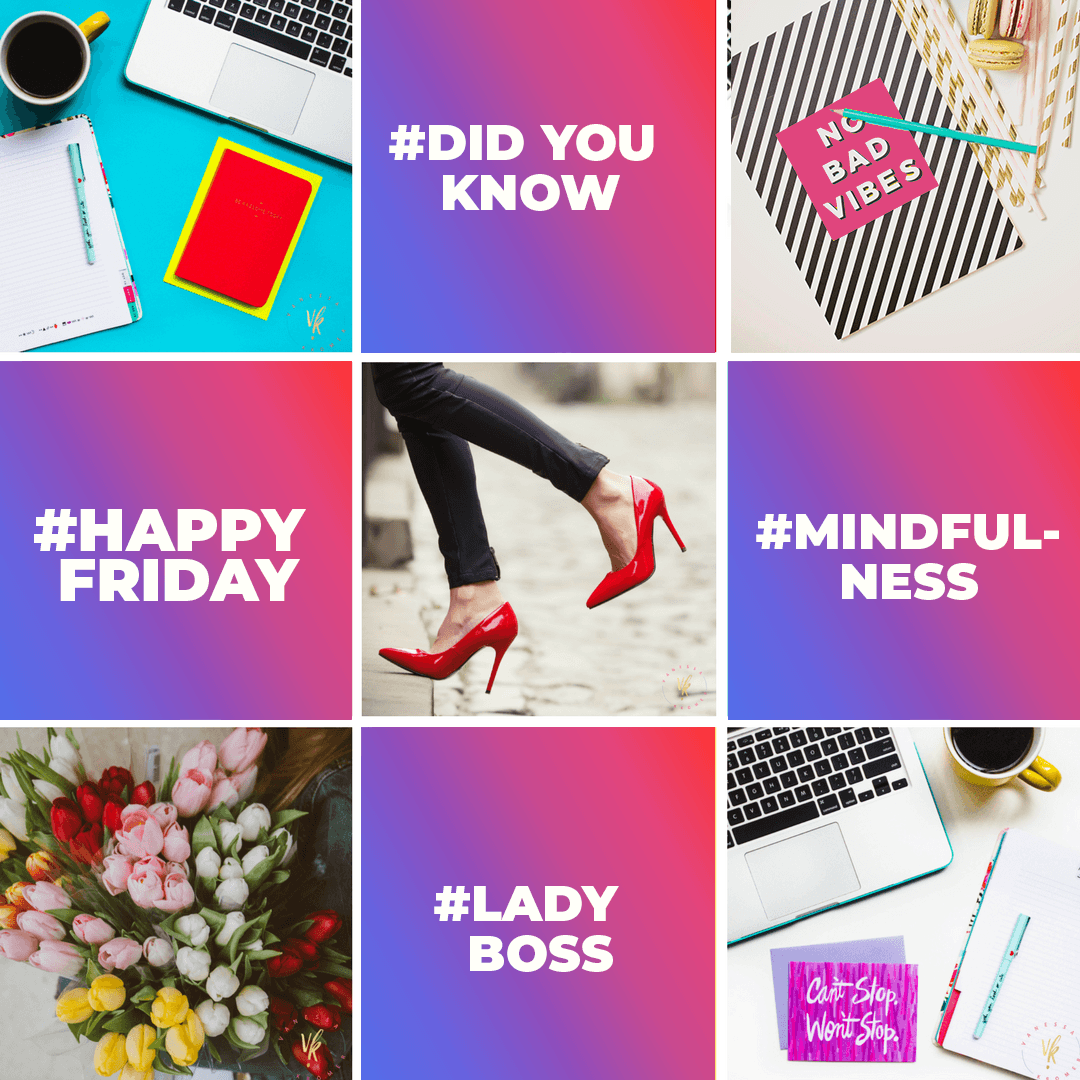
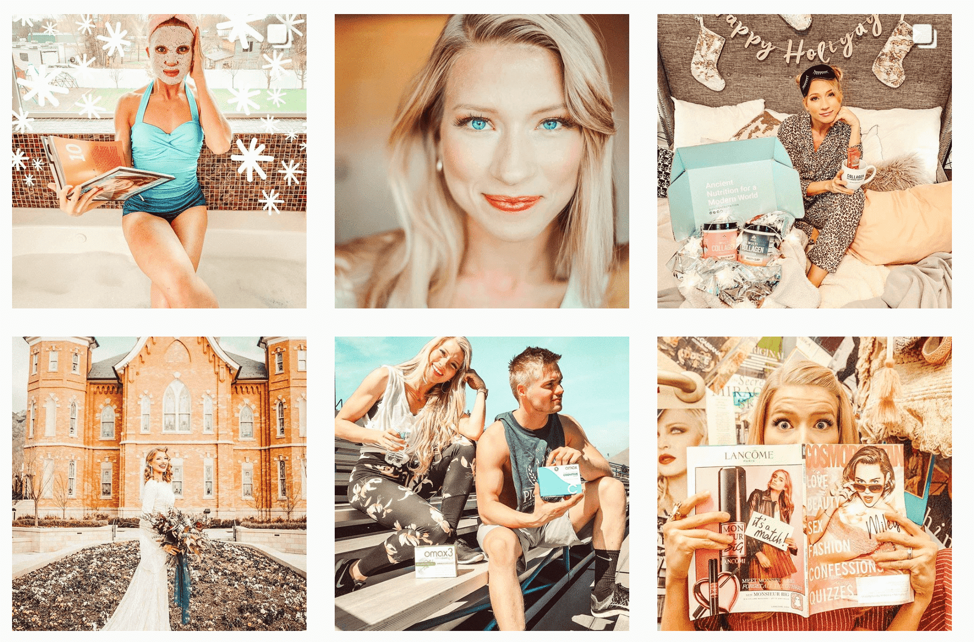
An example of this is @studiomucci who is an incredibly popular Instagrammer who is a wonderful example of visual consistency. Her branding is incredibly youthful, fun and playful which attracts clients and people who appreciate her styling. On top of that, she has a nice consistency of content from pictures of herself, pictures of her home, products and different DIY projects.
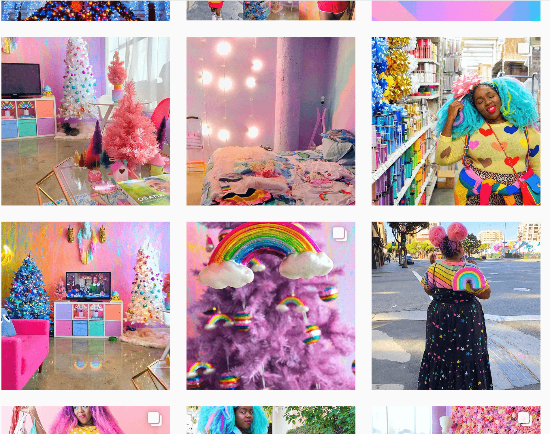
Her feminine, mostly-centered images on pink/purple backgrounds are so identifiable, you know it’s her as soon as she appears in your feed (usually featuring something rainbow, unicorn-inspired or pastel). Her pairings of color and silhouettes are so eye-catching!
In comparison, take a look at this health spa feed…Talk about visual anxiety!
The saddest thing about this account is the “content captions” of the posts are pretty decent, but the visuals do not make you want to go and read them as there is such a disjointed experience between each post (you go from frozen face photography to a wheel of sick people, to island photos, to cows, to unbranded promotions—yikes!).
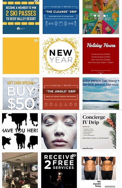
When looking at this Instagram grid feed, you might ask the following questions:
- What is their branding?
- Who is this health spa?
- What is their brand voice?
- What is the experience you want customers to take away?
- What is the consistency a customer can pick up on? (probably none)
Like them, you want to avoid using multiple fonts, colors, and quality of images. By having this disjointed feeling, it makes the potential customer not:
- Understand the brand
- Want to engage with an “unorganized” business
- Want to explore more as they visually do not understand what they are offering
A simple rule of thumb, if you look at your account and wonder about what you do, let alone who you are, you have a problem!
What We Can Learn
Displaying these two examples, consistency doesn’t mean you have to post the exact same thing over and over again. Your audience will quickly lose interest without variety! What will work is having a selection of colors, themes and ideas that all fit within your intended brand.
Make sure you are consistent across all of your platforms from the office, print, signage, packaging, digital, social and content as well as sales and customer service! Customers need that trusted experience that they will know, see and feel the same way across all of these interactions!
A consistent brand matters because:
- A constant brand looks more professional than one that is all over the place with their marketing.
- When you stay consistent people see you created something, not just something you created for marketing or promotional purposes.
- Customers and clients are more likely to trust a business that presents a professional, authentic, and clear brand image.
In reality, if you execute this one principle of consistency well you will kill it on Instagram!
Now that we have covered the basics, let’s take a look at different visual layouts you can implement for branding!
Different Instagram Grid Layout Ideas: Get Inspired
Do not limit yourself to thinking Instagram is just a bunch of square images because it is not.
There are tons of ways in which you can display your images to grab attention and tell your brand story. If you are stuck on how to do that effectively or would like ideas on how to snazz up your content, let’s take a look at some different Instagram layouts you can get inspired by!
Color Scheme
One of the simplest ways to create a beautiful Instagram experience is to focus on color. For some, it’s focusing on content that is branded to your business color palette and for other’s, especially apparel companies, it’s focusing on the colors you want to focus on during a seasonal line.
Aerie offers up a masterful example of this broad layout example because they use white as the neutral base color, and gradually introduce other colors into the mix!
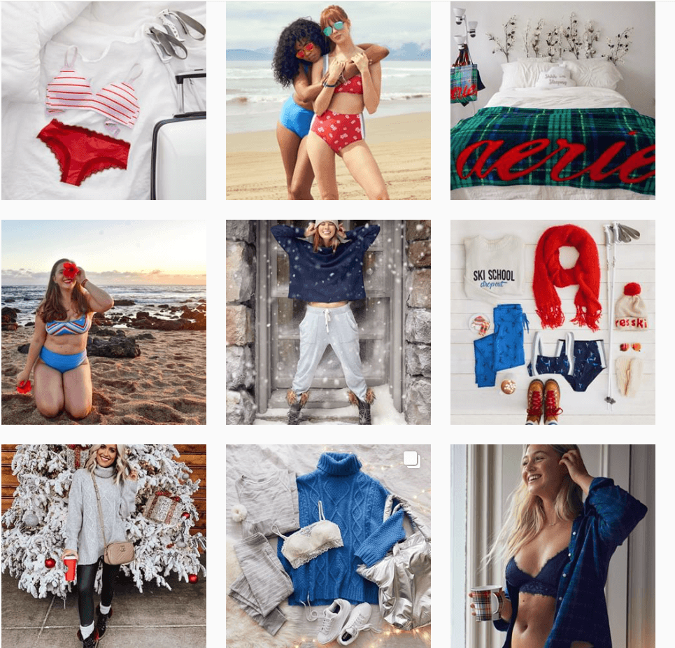
Looking at their whole Instagram grid layout, it’s easy to see that white (or negative space) takes up most of the photo area, and the color they’re featuring acts as a bold highlight for the section. The more you move down their account you see that they continue to use the same base colors but will exchange out colors to easily show gradual transitions, AKA seasonal line changes.
Each photo is beautiful, branded and can stand on its own, but together it has a compelling story of progression and product highlights!
So, like this example, you can focus on color in a few different ways:
- Seasonal products or experience
- Branded color palettes
- Monochromatic focus
- Neutrals with a signature accent color
Think outside of the box and look to use color the best way your brand can!
CheckerBoard
This is a typical Instagram layout many entrepreneurs, individuals and consulting firms use but it is effective when well thought out!
Just like the black and white checkerboard pattern you see on Vans shoes or the cafeteria floors you saw in Elementary school, checkerboard can totally work for your Instagram feed!
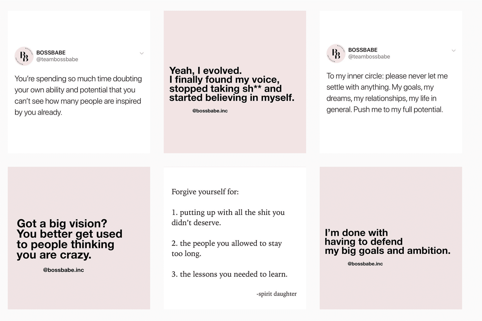
By alternating posts from one after another, you create a strong visual pattern your viewers can experience and therefore easily find the content they are most interested in. @BossBabeInc does a great job at this by creating content that alternates visual backgrounds of pink/white as well as bold and regular typeface as seen above.
Checkerboards can be used in a variety of ways outside of just obvious visuals. Consider using checkerboard with:
- Alternating quotes and photography
- Alternating color backgrounds
- Alternating photography filters
- Alternating black and white photography with a colored background
- Alternating a type of content in sets of 2-3
- Alternating photography content (focus on human, focus on detail shots, etc)
Regardless of how you checker your content, this can be an easy and effective way to present your content as it’s easy to follow and visually striking.
Line Use
Whether it is vertical or horizontal, you can definitely use linear visuals to grab your audience’s attention!
This Instagram grid layout will require you to plan a little bit ahead as it requires you to plan three consecutive posts in a row but it is definitely do-able. For example, @Paperandaplan does an incredible job creating vertical posts that highlight both the photos on the side and separate the questions/tips and statement posts:
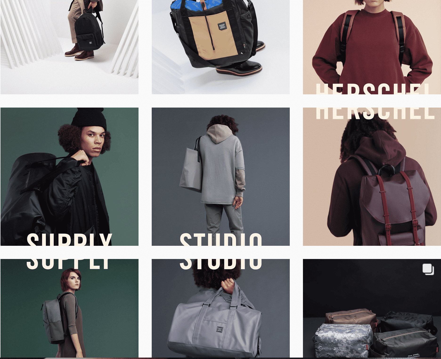
Another awesome example is @Hershelsupply that used interesting photography displays to showcase their new products or collections:
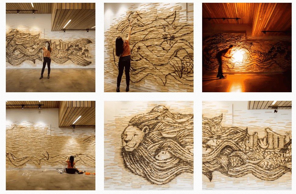
If vertical is not your thing, or horizontal might work better like if you are a resort wanting to highlight location photos or you are an artist highlighting a piece of artwork, you can also adjust your posts to run horizontally to make a statement as @RedHongyi did!
What I love about her horizontal use of Instagram layouts is she not only features recent works of art in entirety but she also gives viewers behind the scene looks into that piece of art following and before the final post! This is a great example of ways businesses and individuals alike can connect what they do with their viewers by making them feel apart of the process.
Like her and other accounts that use this layout, you can use linear layouts for:
- Storytelling
- Featuring whole pieces of artwork or products
- Sharing collections or lines
- Creating focus on certain pieces of content using line breakups
People are easily drawn to lines so this can be an effective marketing strategy if planned ahead of time. If you are looking for quick ways to visually spruce up your Instagram, this might not be the one for you!
BONUS: Horizontal Lines
The diagonal grid layout was explained by Amanda, the Creative Director of Hooray House, and its a complex but cool way to display certain information, if intentionally planned!
All you have to do is choose the types of photos and colors you want to highlight and drag or post them accordingly within an Instagram layout tool like above.
Filters and Color Blocking
Creating a consistent look and feel for your brand across all marketing is incredibly important, as is Instagram. That is why using specific colors and filters can be another easy way to address your visual appeal problem!
There are a few accounts that do this extremely well including actress @Monica Moore Smith and makeup legend Kat Von D.
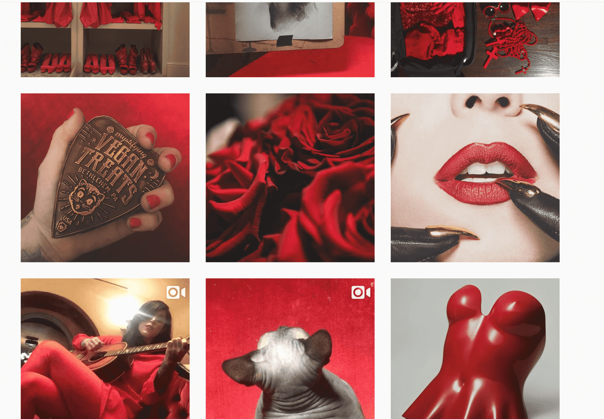
Both of these focus their photography to have certain filters and focus on color. For Monica its warm tones that feature blues and for Kat it is darker, dramatic photography that features reds and blacks.
Like them, you can use photo filters and color to:
- Create brand consistency
- Highlight certain features or products
- Create unique photo experiences to help your business stand out
- Color match to create a pleasing experience
Like them, there are tons of photography filters you can pick from. In fact, I do not have time enough to share my favorites but I will mention some photography programs later in this article you can try out!
White and Negative Space
Sometimes, you need to create a different experience by just getting back to the basics: creating white space.
Many times, by adding white borders to your images you can create a unique style and sense of calmness to your account. Instagram programs allow square borders as well as circular you can apply to your intended images. Two examples of this are SLC Rapper @FrankZoo, and @YukaStudio
Thick white borders make for a clean look on any Instagram feed as it spaces out your photos and makes the content pop.
Further, using thick borders makes your grid look well put together.
BONUS: Color Borders
Color borders are rare on Instagram. So, chances are, you’ll stand out once you use it. They’re great if you want to add contrast to your images.
@beautifulandyummy does an awesome job at standing out in a world where everyone loves minimalistic white.
Puzzle
Saving one of the trickiest for last, the biggest part of creating a puzzle Instagram layout is keeping quality consistent and thoughtful with each photo tile during splitting. Another big obstacle you face using this Instagram layout grid is to make sure each photo tile makes sense visually on its own as well as collectively with the rest of images because if not, people will not want to click on Instagram feeds.
For example, @Simplywhytedesigns and @Lizawildeco do a fantastic job not only creating the individual tiles to be masterful pieces alone but how they beautifully work together to brand images as a whole!
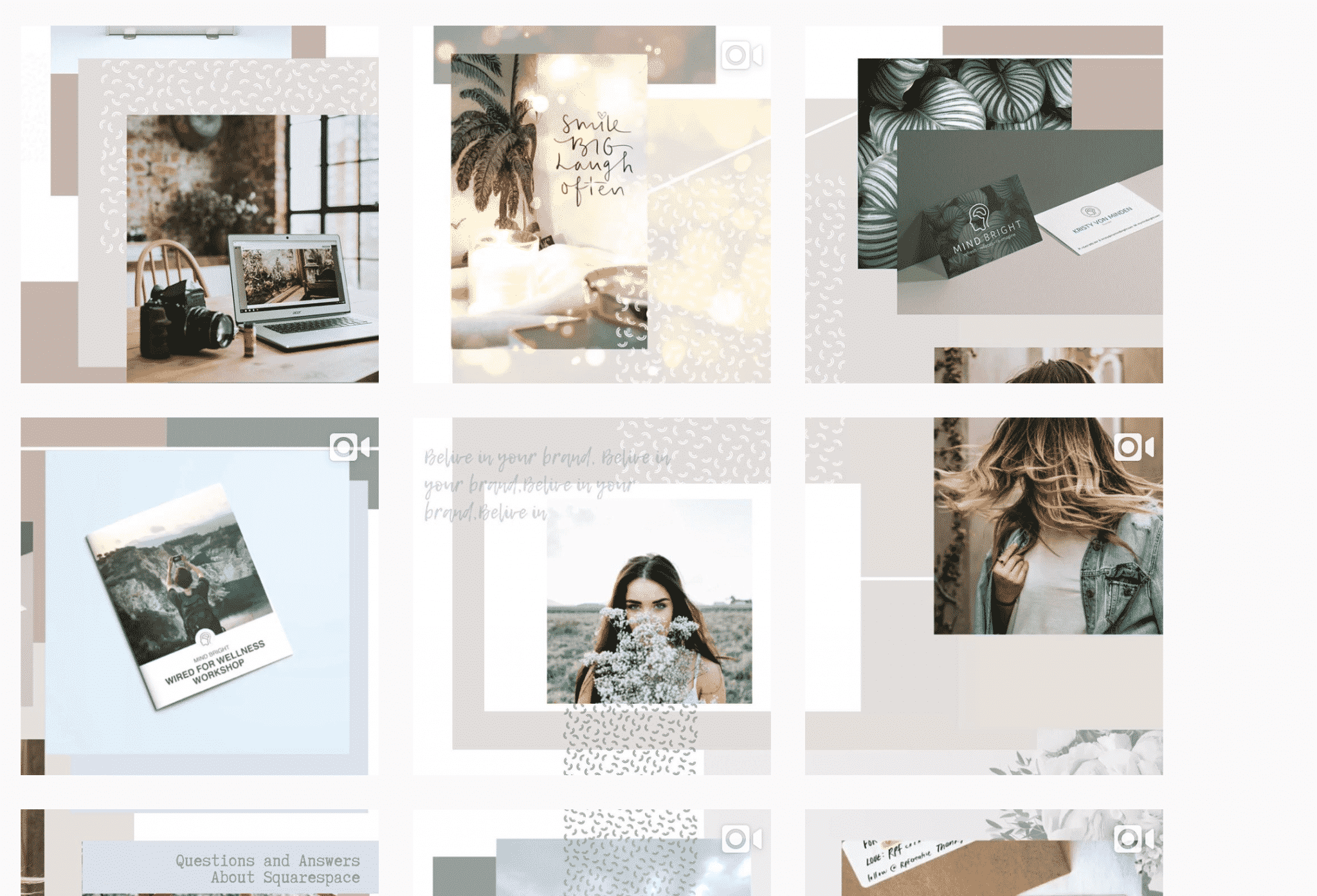
Just like these two accounts, you can use Puzzle layouts to:
- Tell a comprehensive story of your brand
- Give people a reason to believe you are detail oriented and creative
- Add more branded elements beyond just images or photos
Although this Instagram layout is tough to manage at first, you can have a lot of fun creating something truly unique in comparison to your competition.
Experience Consistency
A lot of the time with Instagram, we get too focused on matching, color filters and styling but we also want to make sure our layout grid creates an experience!
Not every Instagram account needs to stay within a certain color palette, nor needs to focus on special borders or photography styles. A lot of the time, you can just have a consistency with content within your images and the experience you are creating with your images.
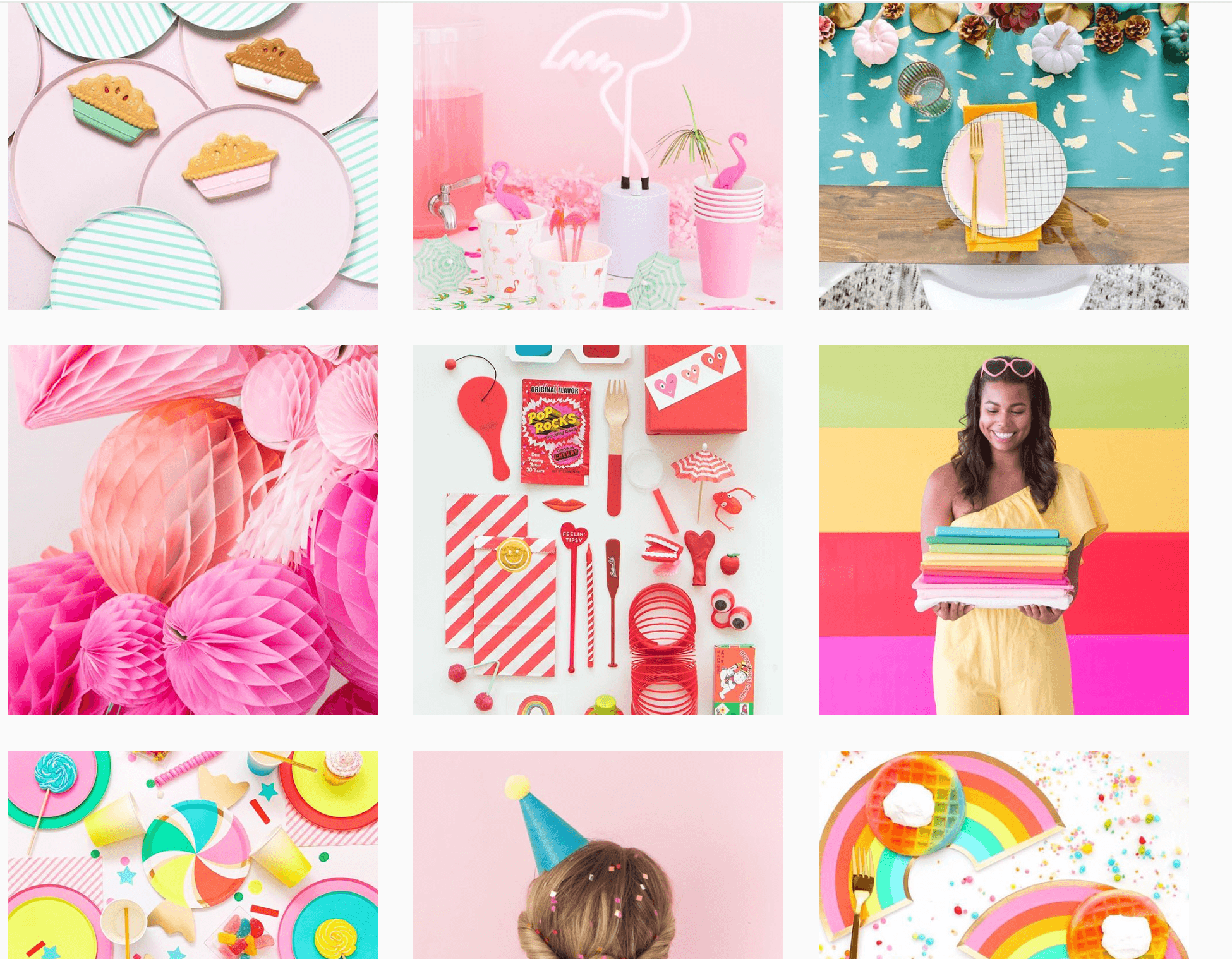
For example, @OhHappyDay typically uses bright colors but is not limited to just 3-5 colors, they use the whole dang rainbow (which is also a layout you can use if you want to catch the trend of rainbow everything these days)
Another use of “experience” consistency is artists @JoshHara who consistently makes artwork on the back of coffee cups which allows viewers to consistently expect that type of content from him every time they log into his account!
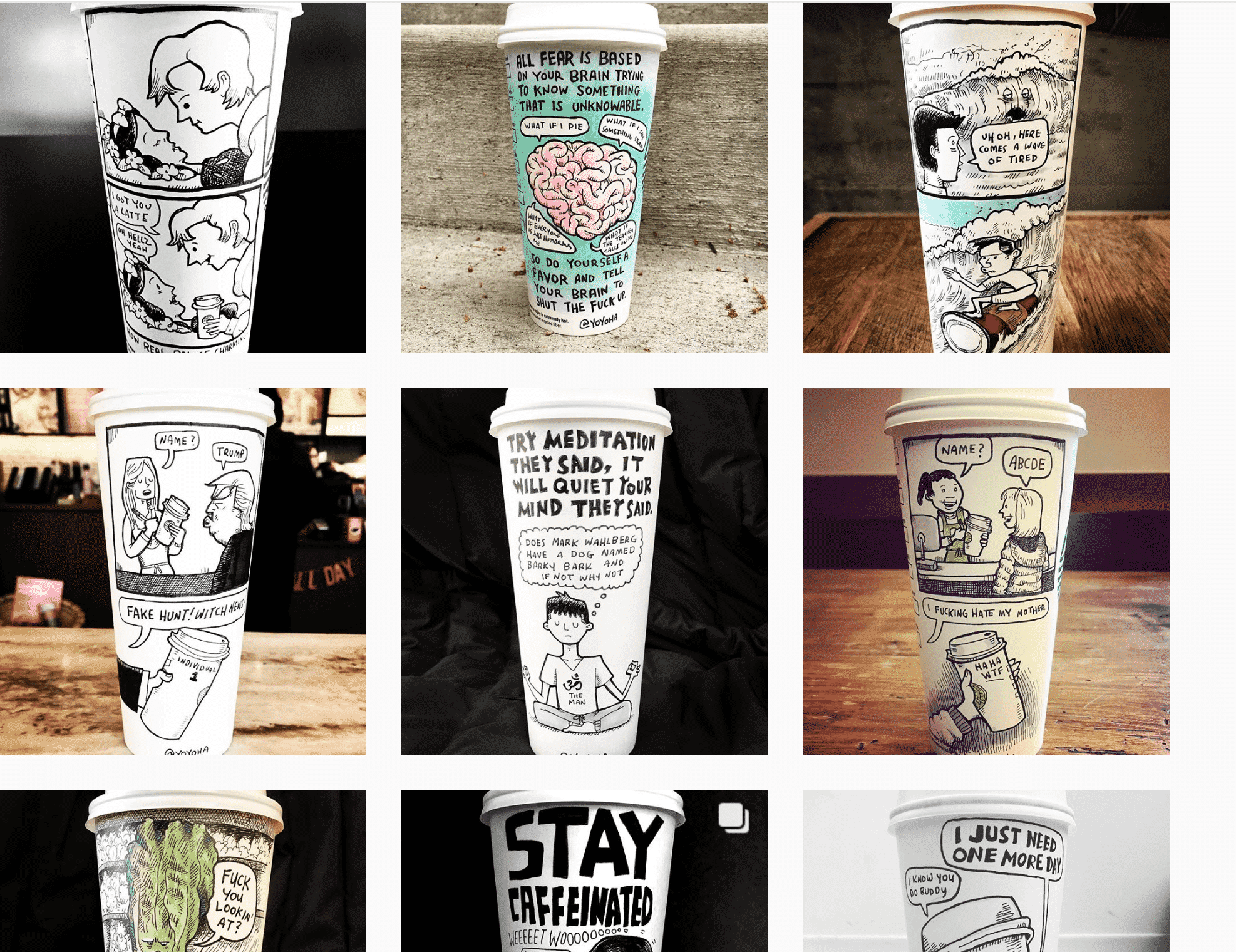
Like these two examples, you do not need to stick to strict visual rules, but you can stay strict on the types of post you consistently post so people can expect that from you every time. They are unique, they are recognizable and they are pleasant for people to engage with.
Like these two examples, you can use content experience to:
- Share industry appropriate advice
- Inspire viewers
- Consistently tell a story or individual stories
- Focus on content with consistent simple images
Whatever your brand or business is about, sometimes it is about beautifully portraying content in simpler ways.
Instagram Layout Tool Options
Now, you might be looking at the Instagram layout grids above and think, “holy crap, how do I do this?!” but you are not alone!
The good news is, there are a lot of creative Instagram layout tools that can take a lot of the management, creativity and stress out of your social media planning!
Armed with the right tools, creating a beautiful Instagram grid becomes actually quite easy. Whew!
Let’s take a look at the following suggested tools:
One of the most popular Instagram grid planning tools due to its intuitive app layout and ease of use. It’s also conveniently available on both mobile and desktop if you need to upload or write copy from either device.
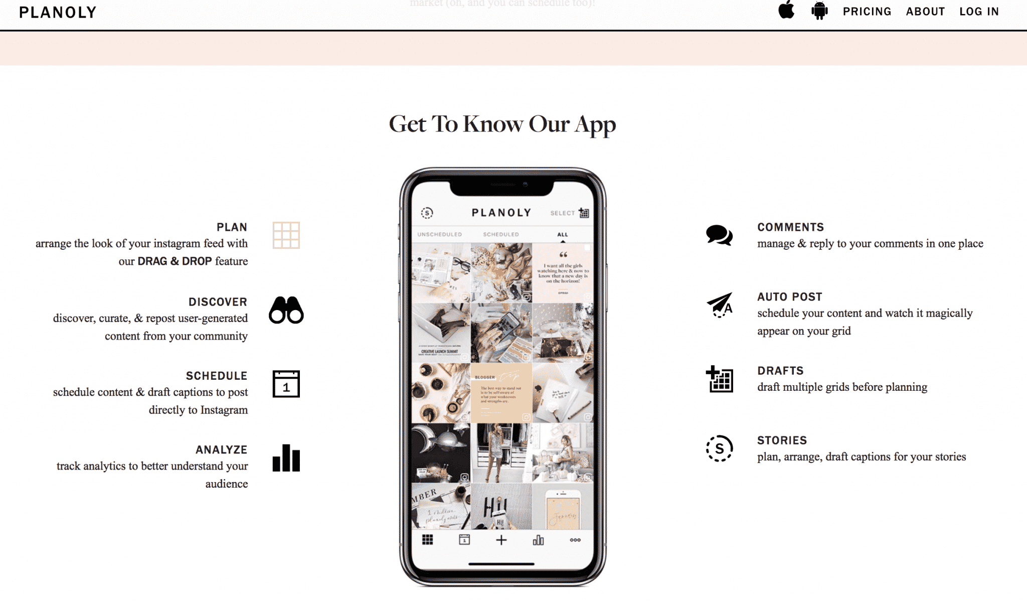
This tool lets you manage and create your hashtags, plan and schedule posts and stories, and access analytics data for your account. The free version has very basic data but as the plan price increases, the data becomes more detailed and comprehensive.
It also has a fantastic feature that allows you to split posts directly so no other tools are necessary. You can then schedule straight from the app and won’t need to worry about the order of the posts.
Cost: Free. For extra features, upgrade to one of the paid plans, which start at $9/month. Paid plans let you add multiple users, access more analytics data, and upload more than 30 images per month.
A popular grid planning tool. Like Planoly, it has an intuitive interface and allows you to switch and rearrange planned posts with the click of a button. It also has a built-in editing tool that’s great for simple edits, particularly if you feel the tone of an image is slightly different from the other content and want to modify it.
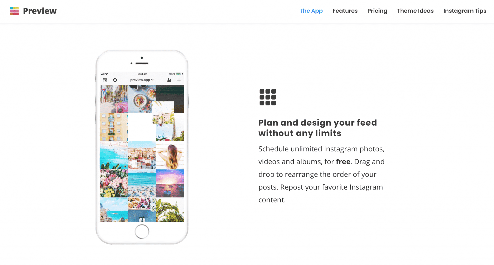
What’s great about Preview is that it lets you upload an unlimited number of images for free, so if you’re working with a large number of images, it’s the perfect tool. The free version contains basic analytics, and you can purchase additional filter packages or upgrade to paid versions of the app.
Cost: Free with no limit on uploads; the paid plans start at $7.99/month for full analytics, hashtag analytics, and full filter packs.
Similar to Planoly, it features a limited number of uploads per month (30) and basic editing capabilities and allows you to plan your grid, curate your grid, and schedule posts with a push notification.
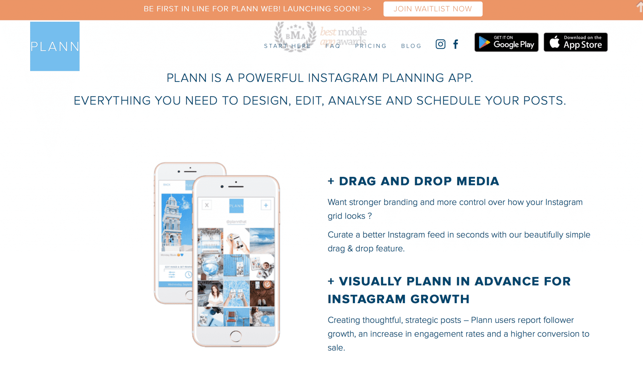
Cost: Free; if you upgrade to the most basic paid version (currently $4/month), you get plenty of extra features such as analytics and a “strategy” plan, which lets you map out the different styles of posts you want to add and even add color-coded placeholders.
Grid Maker for Instagram
Watch separate tiles combine into one mind-blowing image allowing for an unparalleled level of detailing and flexible scaling options! Be it a casual self-shot, a city skyline or a mountain landscape, with Grid Maker they will look amazing on your profile page. You won’t have to shrink or resize your creations ever again.
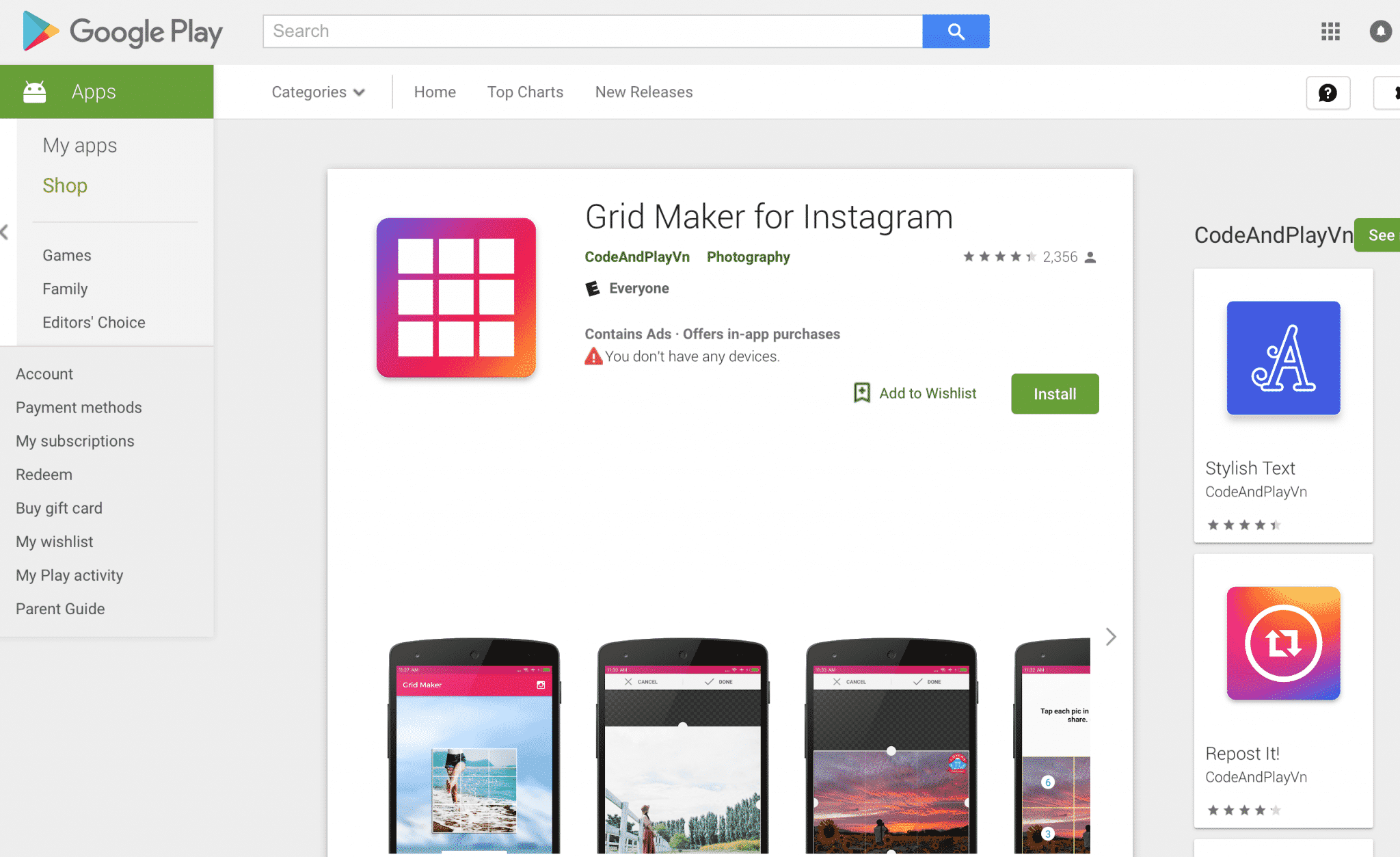
Take a new picture right from within the app or upload an existing one from your Library, choose a suitable sizing option among the 3 available options, and let Grid Maker crop the image for you! All you have to do is to submit the resulting pics to your Instagram in the order suggested by the app. You don’t even have to save the tiles to your device as sharing to Grid Maker is embedded in the application!
Grid Maker introduces a totally new way of using your Instagram, wrapped in a simple and beautiful design.
BONUS: My Favorite Image Editors
A Color Story – An app with a wide variety of filters to choose from, editing tools, and my favorite new feature: video and boomerang filters! I haven’t discovered another app with such a wide variety of editing options! It’s fun to use this app for more creative video effects on Instagram stories.
VSCO – I have used this app from the beginning because their filters and editing tools keep the image sharp and clear, and look so close to actual film photography. This app was developed by photographers which is obvious through the quality and thoroughness of the app’s features. I also use their desktop presets for editing photos on the computer.
Darkroom – Photo editing app that has a wide range of editing tools, as well as some pretty good filters to choose from.
TouchRetouch – This app can do wonders! If there is a distracting item in the background of your photo you can remove the object easily with the “object removal” feature.
8mm – A really fun app to get vintage film effects in your videos.
Grid Be Ready! Changing Up Your Instagram Grid
As you can see there are tons of ways you can do an Instagram layout grid beautifully, the most important thing about a layout grid is consistency.
Whether it is your photo filters, your content patterns, or your color choices, as long as you are consistently branded and relevant to your viewers, you will be alright! Be sure to stick to an aesthetic that highlights your brand’s story so visitors can have a consistent experience from Instagram to your website and beyond!

The options are endless and you should always have fun along the way! So, now that you’ve seen all these creative Instagram accounts, are you ready to start your own and make some changes in how you see your Instagram layout?
What do you think of Instagram layouts and what accounts have you come to love? Share below!


