by Allison Otting • July 31, 2014


3 Quick Tips to Get Your Banner Ad Clicked (With Examples)
This picture is brought to you by the letter T, for Terror. (image source)
I will admit, I wasn’t always a banner ad, girl. I spread the gospel of Adblock far and wide amongst my friend and clueless parents alike. Why would I want something interrupting the article I was reading or plastered all over the margins of my favorite online forum?
Wait, you weren’t hanging out on forums? Oh, uh, me either. No, I’ve never been a moderator for a webcomic forum, what are you talking about.
Let’s be honest, though.
Banner ads have come a long way for the most part. Google has pretty strict rules on what your ads can or can’t look like. Ads have to be legible, they can’t flash in your face or be overly distracting, and they can’t trick people into clicking by appearing as a dialog box or part of the site’s content.
That means you’re only going to run into ads like this on sketchier websites:
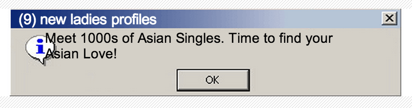 Nope, not from 1999. I found this ad only a couple weeks ago.
1. Make sure it’s relevant
So, banner ad content is better, and they are more targeted to sites that your demographic might peruse.
ThinkGeek is going to push their ads into the more dorky spheres of the internet. Companies that sell baby stuff are going to push their ads in front of people reading Mom Blogs.
Assess your perfect customer, and research what sites they’re looking at. Need ideas as to where to run your ads? Look at your competitor’s strategy using sites like WhatRunsWhere.
As hilarious as it may be, you don’t want something like this to happen to you:
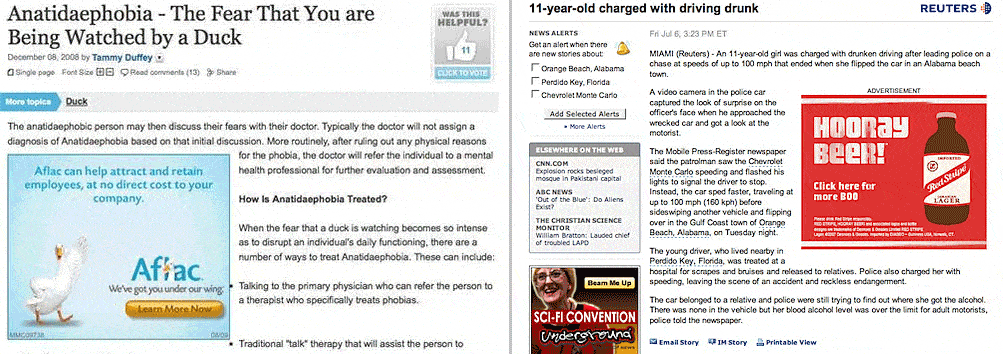 Or is this all an elaborate ruse to get “bad” press? Is there such a thing?! #marketingphilosophy (image source)
2. Make sure it matches what they’re accustomed to
Demographic is everything. What other products are they using? What sort of lifestyle do they live? Prepare yourself, we’re going to delve into some banner ad examples.
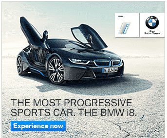
BMW’s ad has a very defined demographic.
This car looks fast. It looks like it could eat your clunker car for breakfast. The typefaces are sterile, suggesting a robotic futuristic clean-design world! There is a lot of negative space that suggests they don’t need to fill you in on why it’s great, because they know you’re going to click it anyway. It’s all about the product.
This banner ad suggests a masculine, action packed, luxurious lifestyle complete with suits James Bond martinis and possibly girls in tow? I don’t know, guys, I’m not a man.
This is exactly like the BMW ad, right?
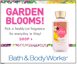
My friend just bought me a housewarming gift from Bath & Body Works, so their flowery scents are on my mind.
While they do have their line of products for men, you’re not going to run into the local motorcycle gang there. Their feminine focus is definitely apparent in this banner ad.
Pink text! Little strips of floral print! Lots and lots of white fits with the cosmetic feel. The focus on flowers and phrases like “freshly-cut fragrance” make you feel like you’re in a tulip field. This ad is appealing to women in the Spring, and it’s doing it well.
Now if they could just figure out how to not give me a headache every time I hang out in their store for longer than a minute. Pink gas masks, perhaps? Let’s talk, B&BW.
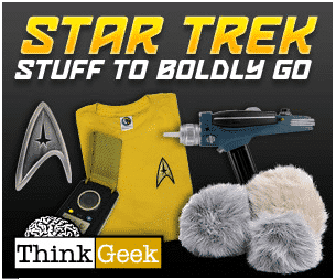
Speaking of ThinkGeek, I bring you… an ad for Trekkies!
Unless you’ve been living in Amish country, you should know exactly what this ad is about. The text is huge and glowing, shouting STAR TREK in your face.
They even have a clever little catchphrase to go with it, something that the most avid Star Trek fan would appreciate. They know fans want memorabilia, costumes and toys. They cut to the chase and show you exactly what you’re supposed to buy.
Even if you’re just skimming the page, you won’t miss this ad. Can you imagine how this ad does on Trekkie sites at Halloween? Ka-ching!
Has anyone else been seeing these ads all over?
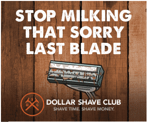
I was hesitant to put this ad up here, because it really grosses me out. I’m gagging a little bit right now, but it is such a good little banner ad!
The wood background suggests the whole manly “Nick Offerman” vibe that is going around right now. The text is almost stamped and reminds me of old packaging for men’s wares (Also their logo, they’re obviously going for this crowd).
This is for the new gentleman of 2014! The one who is tech savvy and a life hacker and is all about saving time so he can buy his fancy hair pomade.
Plus, there is the emotional response of seeing that disgusting razor. I can almost feel it grating against my face, and I’m not even a man (as previously stated). Feel free to use emotional triggers to get those clicks! Just don’t use an actual picture of a gross razor.
3. Decide on your strategy, and test it
These were mostly pretty well designed ads, but there are a plethora of different strategies that you can use when creating banner ads. Try one, and test banner ads against each other. If you’re not testing, you’re wasting time!
- Ugly Ads – There are some pretty sound case studies that support the idea that ugly will convert better. Is it the fact that they’re ugly, or it is it that they look drastically different from the rest of the banner ads we see?
- Bright Colors – A lot of companies will outline their ads with a neon green, or fill the background with a bright red. This can sometimes bring some extra attention! Remember that people sometimes develop ad blindness to this strategy.
- Different Visuals – A lot of times an industry will stick with one kind of imagery between hand drawn images, vector illustrations, photographs and text based. While it sometimes makes sense to stick with what people are used to, a change in visual styles can boost conversions. Surprise people!
- Animated & Static – You’ll see a lot of animated ads, whether it’s a GIF or flash file. If you have a story or a lot of information to share, animated might be the way to go. Beware, the ad space is filled with moving ads. While our attention is drawn to moving objects, people are developing ad-blindness.
These are just some of the ideas you could try. Remember, you need to set yourself apart in any mode of advertising. Banner ads are not exempt. Be creative, and try to determine what strategy is going to work the best for you.
Ready to build those ads? We’ve got your standard sizes for Google AdWords right here. That’s how much we love you.
Want some ideas for your landing pages? Download our free guide!