
by Jarrod Hunt • December 9, 2015


Use Menus and Breadcrumbs to Serve up More Website Conversions
Whether you’re making money directly through e-commerce or using your website to drive traffic to your physical business location, your website’s ultimate goal is to convert visitors into buyers. A professional look and compelling copy are essential…and so is a layout that’s easy for visitors to navigate.
Many elements go into a great website design, but two stand out when it comes to navigation. Better menus and breadcrumbs could be your ticket to easier navigation—and a website that delivers conversions.
Menus
Your menus help visitors make sense of your site’s layout. Primary menus provide links to products, services pages, or other content that relates specifically to the purpose of your site.
Secondary menus work for about pages or pages describing how to advertising on your site, if applicable. You can test different menu placements, wording, and visual elements to see what your visitors prefer.
Placement
Many sites have horizontal menus across the top of their pages while others have vertical menus on the left and right sidebars. They’re straightforward, simple to understand, and work well for most businesses.
In some cases, sites use really creative menu design. Sensi Soft, a Polish Web development company for classified advertisers, uses menus in the center of its page. Visitors click arrows that spin the pole and display different parts of the menu:
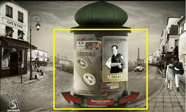
In most cases, a menu like this looks great initially, but it confuses visitors and makes it hard to understand what the company does. Unless you’re trying to position yourself as highly creative the way Sensi Soft is, go with a more conventional menu.
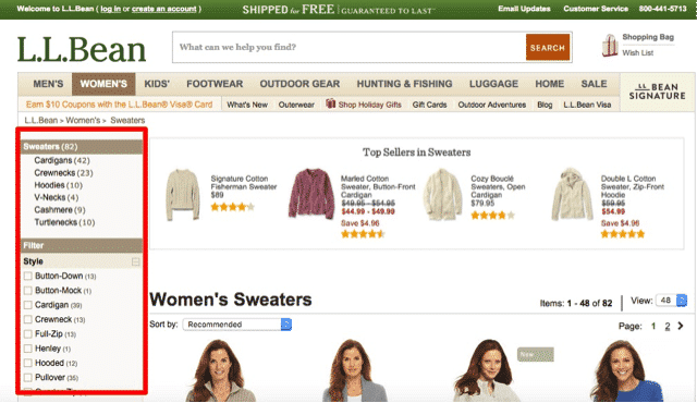
A common design mistake that can hurt website conversion is to place a primary menu in the left sidebar, which typically receives little attention from a visitor. If you place a menu on the left, make it a secondary menu, or create a menu that’s highly useful for e-commerce, like this one from L.L. Bean:
 Wording
Try to avoid generic wording when you label your menus and opt for language specific to your business instead. Even better, choose keywords that will help both search engines and visitors understand what your site is about.
Visual Elements
Some menus skip wording altogether and use icons for navigation. Unless your visitors would have no problem understanding your icons immediately, use them as supplements to explanatory text instead of using icons alone. For example, the hamburger menu icon is popular on mobile websites, but it’s usually unnecessary on desktop sites. Use this icon as a space-saver if you must, but at least add the word “Menu” beneath it.
Breadcrumbs
Breadcrumb navigation is a great way to clarify the structure of your website. Breadcrumbs are also search engine-friendly, and you can include breadcrumbs in a page’s structured data markup.
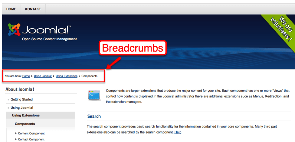
In many cases, you can use a simple plugin, like Breadcrumb NavXT, to automatically place hierarchical breadcrumbs on your site. If you’re working with a custom website developer, you can also use different types of breadcrumbs, including:
- History-based breadcrumbs. History-based breadcrumbs display each page that led visitors to their current URL. History-based breadcrumbs are good for retracing steps on an e-commerce site.
- Attribute-based breadcrumbs. Instead of using a sidebar menu, some e-commerce sites use breadcrumbs for narrowing down results. Zappos uses both breadcrumbs and sidebar filtering to help customers navigate its product pages:
When you add hierarchical or history-based breadcrumbs, make sure to use complete page titles for each displayed page. Separate them with a > instead of a colon, and display the current page title in bold text.
Final Thoughts
Before switching to a new menu or breadcrumb design, try A/B testing different pages. For example, create two versions of a menu on your home page and track them in Google Analytics to see which menu visitors prefer.
- In Google Analytics, choose Reporting > Behavior > Experiments. Then, click Create experiment.
- Follow the wizard’s instructions to test your two home page menus. You’re testing which menu does a better job of getting visitors to click through to additional pages, especially on conversion-oriented pages.
If you’re not sure which pages on your site deliver the best conversions, monitor your visitors’ behavior flow in Google Analytics (or using a heat map program, like Crazy Egg, to see how they utilize each page). You’ll learn which pages convert best for your visitors and how they get there — and you can use strategic navigation suggestions to put them on the path to conversion.


