
by Andrew Maliwauki • January 22, 2015


Landing Pages: What Do You Really Need Above The Fold?
Grab your visitors’ attention right away before they stop readi….hey don’t leave yet!
To scroll or not to scroll, that is the question. Many a designer has pondered these words while creating landing pages whose sole purpose is to bring high, quality traffic to their client.
I don’t have all the answers, but I do have some insights about what to do to create effective landing pages. More specifically, about what to put above the fold of your page and what to put below in order to get that conversion rate up! So let’s begin.
One of the most common mistakes poorly designed landing pages make is cramming too much content onto a page. News flash! The majority of visitors don’t read what you have on your page; they skim.
Want to get scientific about it? In 2013, analytics vendor Chartbeat analyzed Slate and other websites and found that most visitors scroll through about only 50-60% of an article page. Fact: most people probably won’t even finish this post, which makes me a little sad. 🙁
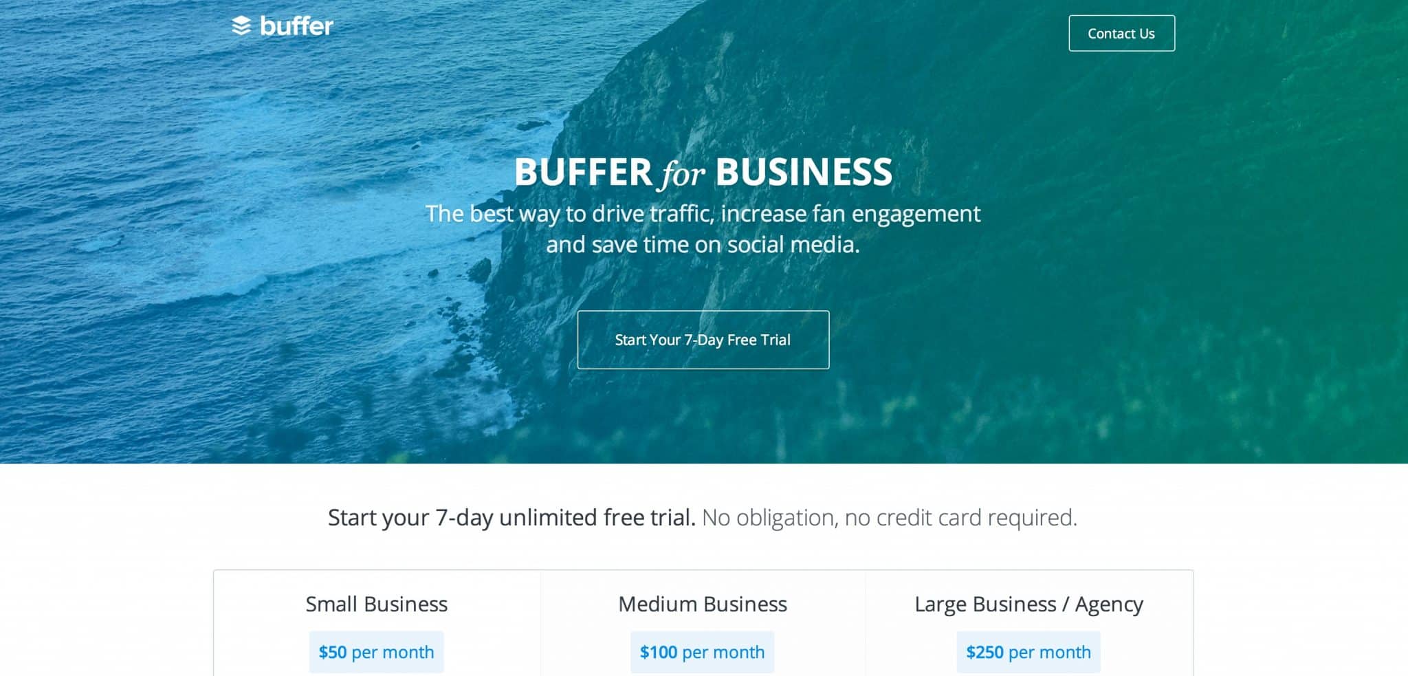
Buffer.com’s homepage is easy to skim! (although the CTA button could stand out more if it were a landing page)
So, back on point: people don’t read, and you need to be prepared for that when they arrive on your landing pages. And while I wish I had a sure-fire answer on how to keep those slippery fish from jumping out of the barrel, I do at least have some strong recommendations, starting with one word: simplification.
If your page is filled with lots of text (and I’m sure it’s all great stuff), don’t be afraid to shove it below the fold or toss it completely.
Keep a headline, a sub-head and CTA, along with a stellar hero shot that is engaging and grabs the viewer’s attention. Not only does this look amazing from a clean design standpoint, but it puts the focus where you really need it. Just make sure the text you do use is concise enough to give anyone who doesn’t know about your product or service an adequate understanding at first glance.
Now, some people reading this might be thinking, “but what if they don’t know they need to scroll down for the rest of it?” And for that, I have yet another great statistic: Heatmap service provider ClickTale analyzed almost 100,000 page views and found that people used the scrollbar on 76% of pages, with 22% of those being scrolled all the way to the bottom of the page, regardless of length.
Crazy right? Most viewer’s natural reaction when visiting a web page is to scroll, so give the people what they want!
[Tweet “The majority of visitors don’t read, they skim. How should that affect your design?.”]
However, if you’re still worried about it, just make sure your page layout is designed in a way that encourages scrolling. This could be as simple as adding a downward arrow that slowly moves back and forth. No landing page is the same, so as always, I recommend continuous A/B testing so you know what works best for you!
Now, I’ve put a lot of emphasis on the design aspect of the landing page, but as with anything, focusing on design alone won’t dramatically improve your conversion rates. I can’t tell you how many times I’ve re-designed a landing page from an existing design only to find it performs horribly. Why? It’s all about the copy and the information you provide. Sometimes making it too simple can hurt your conversions, especially if you leave out critical words or phrases that easily communicate what your product or service is.
Many people think of design more as decoration, when in reality it’s about how something works. Great design is about form and function, so keep that in mind when you’re creating new pages or redesigning old ones. Use your new page layout to solve problems and not create new ones. Easier said than done, I know, but I have personally seen improvements in many of the landing page variants I’ve worked on.
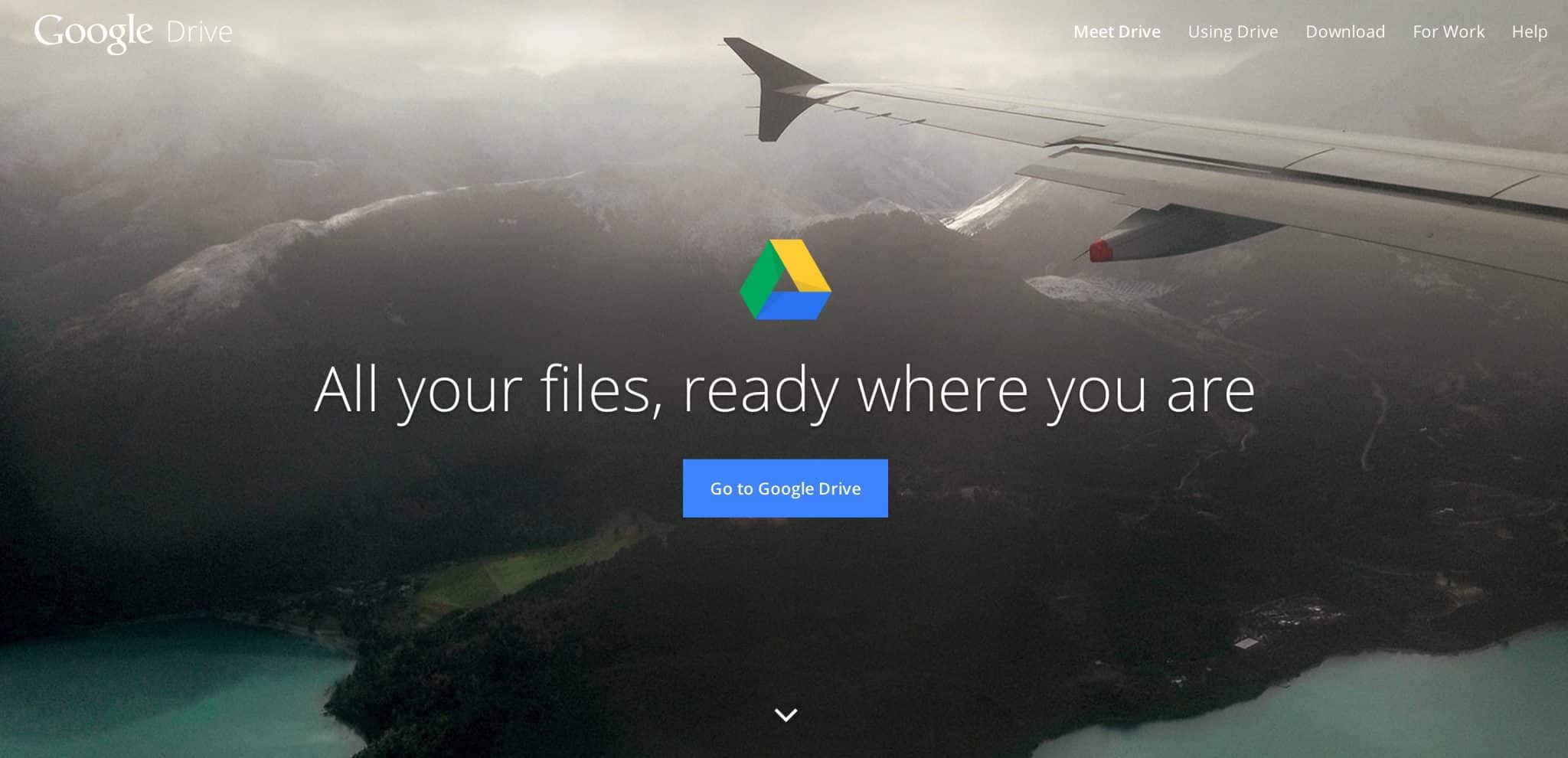
Google Drive’s attractive, simple homepage. That little arrow on the bottom bounces to indicate that scrolling is possible.
For example, a recent redesign for a medical software company’s landing page increased conversions over 180% in the first month of testing! By removing a lot of cluttering data, simplifying the copy and using a flat art style, we were able to see some real progress that actually made a difference for our client.

So when it comes down to it, make sure you have an experienced designer and copywriter working on your pages. Hand-in-hand, getting those right will perform wonders for your landing pages!
Another aspect of designing above the fold you’ll frequently come across is where and how to place your CTA. It’s not always an easy choice, and depending on your industry focus, you need to consider certain things. Is your service or product easy to understand? Do you need a lot of text to properly explain the featured benefits? Some pages can get away with a form right away, while others may need some more explanation before a viewer is ready to dish out their personal information.
[Tweet “We removed landing page clutter to improve conversion rates for one client by 180%. Here’s how.”]
Try experimenting with different layouts and options, such as a smooth scroll button to the bottom of the page where your form is located. As a rule of thumb, try to keep your headlines under 8 words, and make sure you have a nice typographic hierarchy so that your text reads with ease. When in doubt, keep it simple!
Creating a high converting landing page isn’t something that you’ll probably get right on your first variant, but after lots of tests, both big and small. If you ever are in need of great examples of smart landing page design, I highly recommend checking out themeforest.net or awwwards.com. Both offer great examples and you might even find a template for a similar industry that will work well with your client.
Hopefully you’ve all learned something that will help you create that next amazing landing page, and if you think I’ve left something out, let me know in the comments! Now get out there and boost those conversions!


