by Allison Otting • January 10, 2014
5 Ways to Improve Your Landing Page Today
So you’ve got your brand new landing page and you’re pretty stoked. It’s your baby, so you’re pretty bummed when it’s not doing all that great.
But, conversions are low and when you asked for help, your pretentious designer friend only muttered about typography while adjusting his fashion scarf. How can you improve your landing page?

Well, and I’m here to give you the basic information that you need to turn your stumbling little landing page into a rocking PPC legend.
1. Make your headline match your content!
The headline will be one of the first factors either keeping them on that page, or making them hit the back button. Now there are plenty of articles on how to write punchy headlines, but I want to remind you that headlines really need to match the content of your landing page.
When you’re searching for a product or an answer, you never want someone to waste your time with irrelevant information. The last thing we’re looking for is your potential customers associating your company with frustration.
2. Pay attention to visual hierarchy
Us designers can throw out a lot of jargon when it comes to our profession. Adjust the kerning, bleed the illustration through the gutter and make sure you typeset the copy for the Pantone proof by Friday! It can occasionally make us sound a bit pretentious.
Let’s forget at all that for a moment, because I’m going to share with you one of the most important tools I learned with my degree:
Squinting.
 Oprah knows. (source)
When you squint, you’re ignoring all the little details of the design, and you see the big picture. What elements of the landing page stand out the most? What items are most important for your customer to pay attention to? Those two things must align!
Now the hierarchy of your page can be determined by size color, value (light vs dark), position on the page and relation to negative or whitespace on the page. Using these variables will set an order of importance that will tell your customer where they should look without them even thinking about it. Who doesn’t want to improve their landing page with mind control?
3. Keep the important stuff above the fold
In a lot of ways, your landing page is a lot like the front page of the newspaper. You need to convince the passerby to pick it up and buy it from the newstand, even if they were only stopping for a pack of gum. (Is that reference too old school?) The way you can do that is to keep all your essential information above the fold.
The fold is the top part of the website that is seen without scrolling down whatsoever. Most of us are going to make our judgements off of that first impression and decide whether the page is worth our time or not.
So, what do you put above the fold? Here’s a basic checklist:
- Write a headline that assures the customer that you have the solution, but leaves a little mystery.
- Include benefits and reasons as to why they need your product or service in their life.
- Insert a photo or illustration that shows what your product or service even is.
- Make sure that your customer can complete the desired action without scrolling down.
- Keep it simple and easy to read (Remember hierarchy? That applies here!).
If you’re not sure where to start to improve your landing page above the fold, study the landing pages of your most successful competitors. Now we don’t want flat out plagiarism, but espionage is welcome in the design world. We just call it looking for inspiration.
4. Make your “Call to Action” actually define what action is taking place
My brother once blindfolded me, sat me in the back seat of the car, and told me to guess where we were going without taking a peek. He ended up driving me to a Dairy Queen, but because I didn’t know what was going to happen, the situation was stressful.
For all I knew, my brother was going to drop me off in a field and drive away.
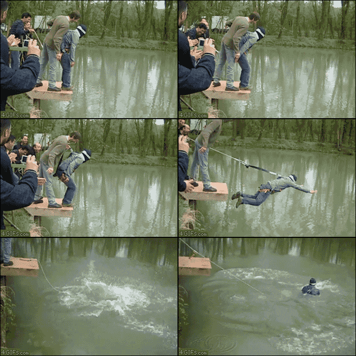 It could have ended a lot worse. (source)
Don’t let your potential customers feel that way. The internet is plagued with form buttons that say “submit” and “continue.” I don’t need to tell you that there is nothing tempting or comforting about those two words.
Tell them exactly what is going to happen next, like “Start My Free Trial” or “Download My Free E-Book.” You’ll get a lot more conversions if they know that Oreo Blizzard is waiting for them at the end.
5. Adjust your content to the attention span of your customers.
People are always talking about how this generation has the attention span of a fly. “Sesame Street has ruined us!” they cry, and people mourn the slow deterioration of our minds.
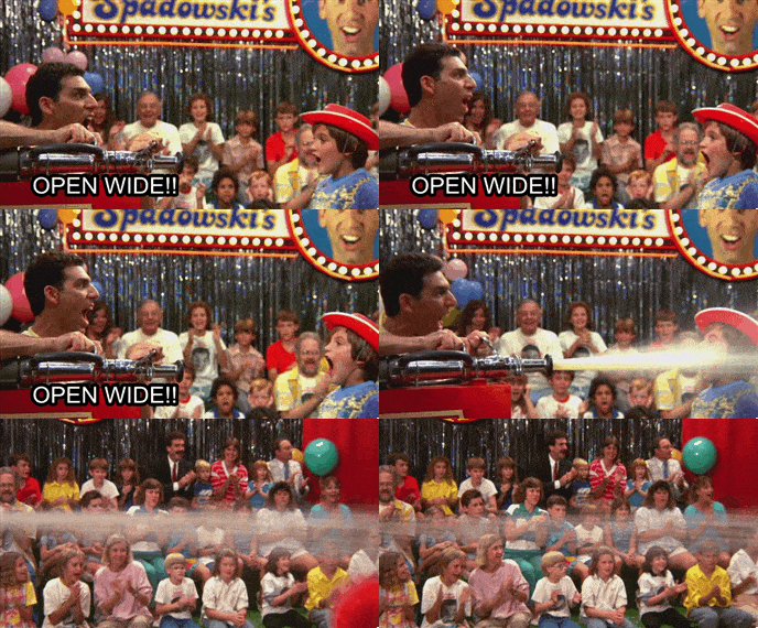
As a member of this generation, I prefer to say that we just don’t like to waste our time. With so much information, we want to be as efficient as possible in consuming and processing information, so when there’s too much of it…we feel like this:
Don’t scare people off! Improve your landing page by breaking information into easy to swallow chunks. Try these different strategies in assembling what you want on landing page.
- Lists! People love lists because you can easily skim them and glean exactly what you need to know.
- Graphics. These are especially effective to illustrate a process. Be warned, though. There’s such a thing as too much of a good thing.
- Break up your copy. Sometimes, a substantial amount of copy is necessary and appropriate. In those cases, break it up into paragraphs. Follow the same sort of rhythm that you would when you speak.
By making your content easy to process, you’ll drastically improve your landing page. When people don’t run away, your chances of people converting are much higher. If you want to go the extra mile, make your content something that people want to read. That’s another blog post for another day, though.
Don’t take my word for it!
Not every suggestion is going to be a solution for every landing page. The great thing is, you don’t have to guess. PPC marketing let’s you test the effectiveness of every change until your page has reached its full rockstar potential. Just remember that if you change too many things at once, you’ll have no idea what did what did improve your landing page. Take it nice and slow.

