by Sarah Rodriguez • October 29, 2015


7 Beautiful Landing Page Design Examples
Designing a landing page but having trouble getting inspired? Or maybe you don’t know where to start?
Finding the balance between a beautiful page and a page that performs well can be tricky. If you’re looking to up your landing page game, keep reading to see seven awesome examples of landing pages and why they work. Hopefully you’ll find some cool elements to try on your next landing page!
Retargeter
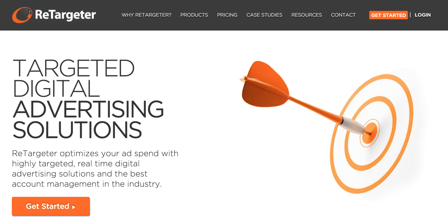
I love the cleanliness and organization of this page. The service is clear (digital advertising) and the paragraph under the heading goes a little deeper into their company and how they can help their viewers. Scrolling down the page, there is organized and easy-to-understand information about their process, benefits, and specific services to help customers make an educated decision.They also present clear and obvious CTAs throughout the entire page (Get Started).
If I were to run a test on this page, I might try consolidating the nav bar into one page so that their audience isn’t distracted from the CTA and message of the page. Overall, this LP does a good job of presenting a lot of relevant information in a very clear and focused way.
Lyft
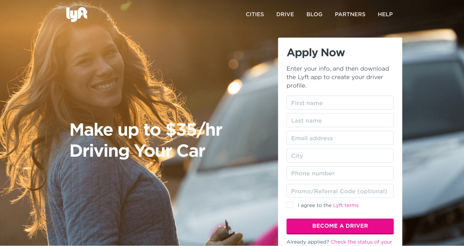
This landing page is a great example of a lead generation form above the fold, and I especially like the simplicity of the page. The headline does a great job of showing how their viewers will benefit from applying. The form is relatively easy to fill out and is set up so you are automatically creating your own driver profile.
This page also has some great content below the fold. They’ve included a brief overview of the company, simple icons explaining why you should drive for lyft, a useful FAQ section and even a wage calculator. A scrolling header, like shown on this page, is also a nice way to keep your brand and CTA visible to your viewers at all times. This is a great example of a simple yet effective landing page, especially if you want your viewers to fill out a form or give you their information.
H.Bloom
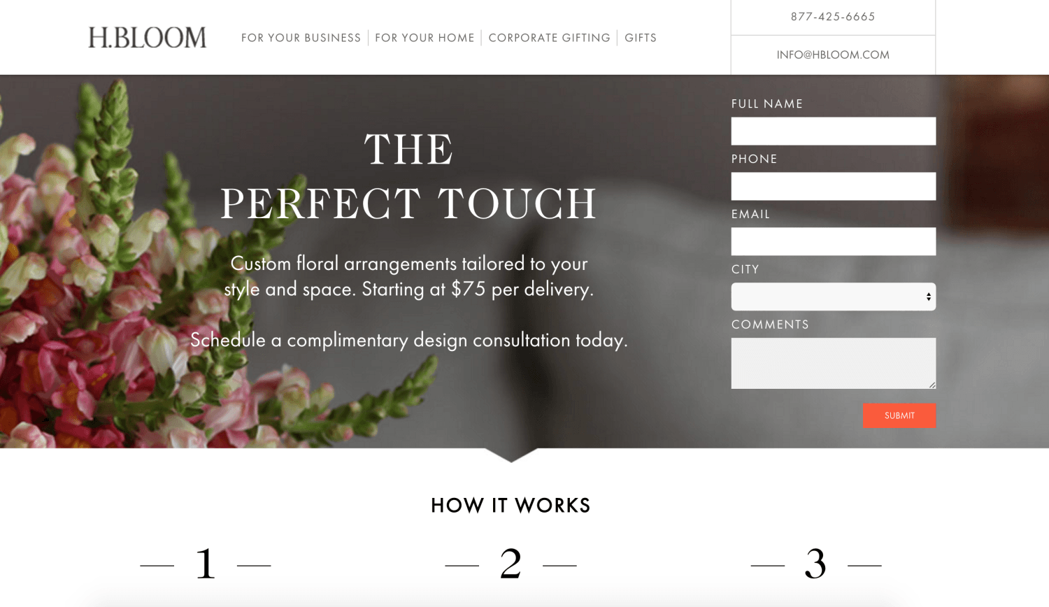
This page is another great example for lead generation page ideas. H.Bloom has done a great job integrating their contact form into the design of their page. The heading and subheadings are really well written, and they are able to show you their service, promote their value, and offer you a consultation in just a couple of sentences. Though, I might try labeling the form or changing the button copy to be more cohesive with the “free design consultation” CTA mentioned in the subhead.
It also works really well that the page immediately gets into the three steps of their process and what you would do to get your custom floral arrangement. Clarity is such an important thing to remember when creating a landing page. You don’t want to risk your viewers leaving the page because it is confusing or they can’t find what they are looking for.
Asana
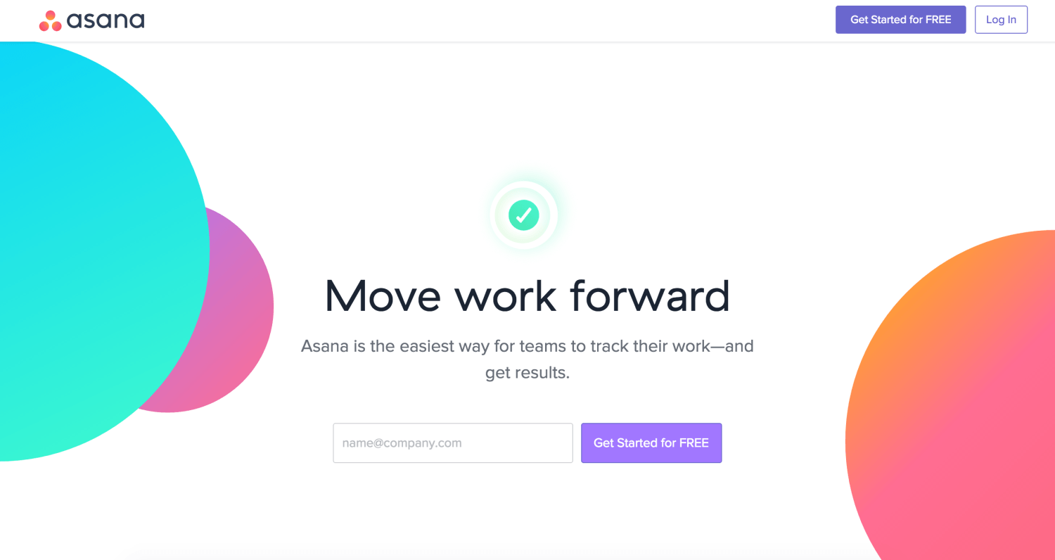
This page is a great example of a focused landing page. Visually, your eyes are quickly drawn to the center form and CTA. The heading and subhead and short and sweet and the call to action is easy to identify (get started for free). Asana also has some great content going down the page with examples and screenshots of their program, major companies they’ve worked with, and very visually interesting video.
I also love how they’ve added a final call to action and form at the bottom for people who might need more information before giving up their email. This page is visually great while being effective, clear, and focused. The bright colors and simple shapes really add to the overall effectiveness of this landing page.
MyRoofingPro
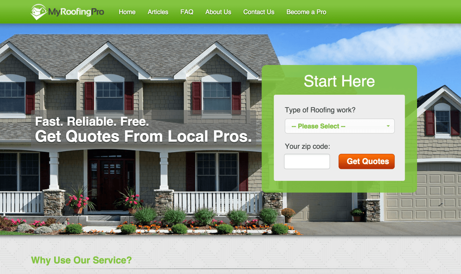
If you are in the service industry, this landing page is a great example for you to look at. MyRoofingPro has a really great form and CTA. The form is inside a green box, showing it’s importance on the page, and the first step of the form is very easy for potential viewers to fill out.
A multi-step form like this one is a great way to “reel-in” your viewers by asking for easy info (like a zipcode or a simple dropdown question) first to make them feel like you are personalizing their quote or offer. One thing I would test on this page is to break up the content below the fold so it’s a little easier to follow and not as overwhelming. But overall, great above the fold content and layout.
Recurly
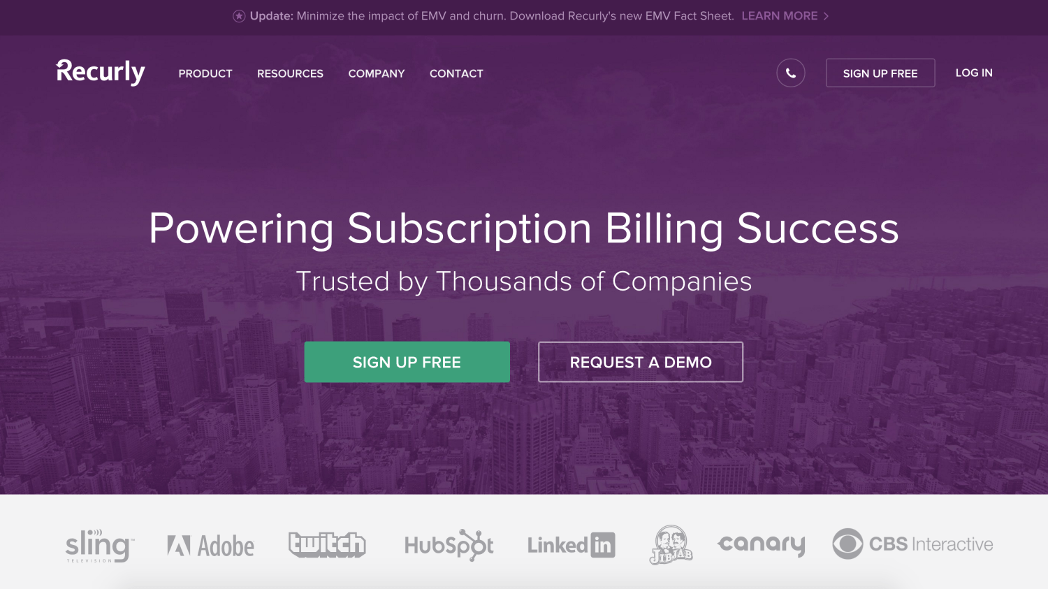
The first thing you notice about this page is the ‘Sign Up Free’ CTA button, which can really help with conversions, especially if your service is free or low risk. Some industries have to give their viewers more information before they feel comfortable signing up or handing over their information. For a page like this—where signing up is free—it can be a good idea to present your CTA right from the beginning so it stands out.
I also like the social proof shown in logos from companies who use their products. This really helps to create trust and credibility in the mind of the user and therefore creates a higher probability that viewers will convert.
As you travel down the page, Recurly has done a great job of showing only the most relevant information in a way that holds the viewer’s interest. Its important that information on your landing page is more than just one big block of text. Create imagery, break up the text into sections, or use icons to add interest to your page’s content and make everything skimmable and “bite sized.”
Bloc
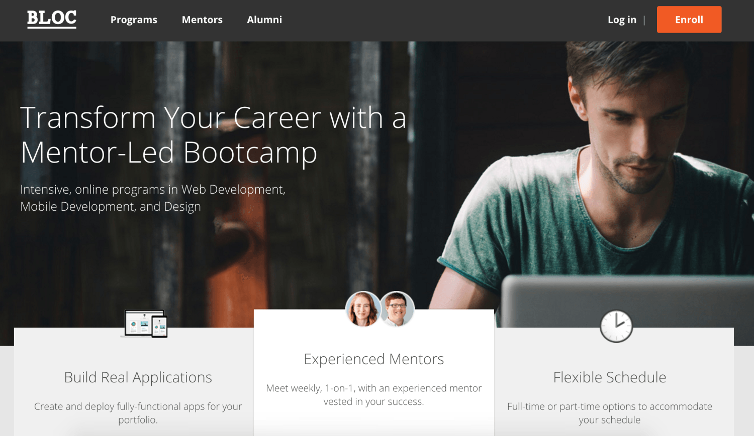
Bloc has a really good looking page that has several elements that suggest this page converts well. There’s a great headline and subhead that not only tells you what they do, but how their product will directly effect the user. The enroll button, although in the top right corner, is very easy to spot for those who are ready to get started.
The hero shot is relevant without looking too cheesy or “stock photo-y” and the content gets started right away, even popping up above-the-fold. The benefits of the company are clearly listed and organized in a way that (again) shows how it can help the viewer specifically.
The only thing I might try with this LP is adding the CTA/button at the bottom of the page or more throughout, which may help conversions by reminding viewers of the purpose of the page. Bloc has created a beautiful page with effective copy and organization.
Feeling inspired? Want someone here to give your landing page a critique? Let us know in the comments.