
by Andrew Maliwauki • November 5, 2014


5 Essential Elements of Landing Page Design You Need To Be Using
Want to turn your landing page idea into a bright one? Remember these 5 things…
When it comes to landing page design, you may not always know where to start, especially if the page is centered around a product or industry that you’re not very familiar with.
By knowing and understanding the basic elements and best practices of historically successful landing pages, you can take these 5 essentials and create a high-converting landing page in no time.
The Big 5
As a general rule, here are the 5 essential elements you need to include in every landing page you create.
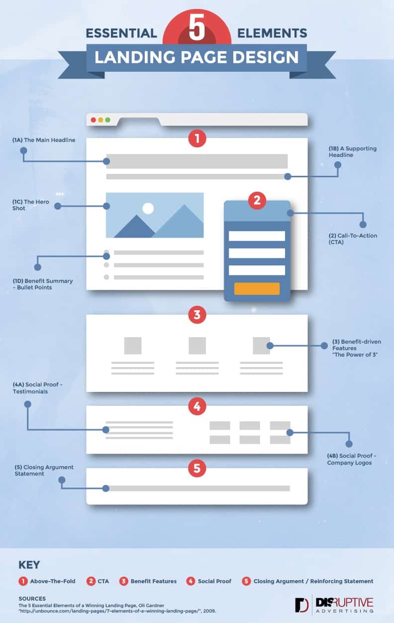
If you have ever searched the web for landing page inspiration before, you’ll most likely be familiar with most of these; I’ve just grouped things together in a way that I think makes the most sense. Take a look at this handy infographic that will outline the rest of what will be discussed in this article.
Be cool and embed this infographic on your site.
#1 – Above-The-Fold
This could also be called the “attention grabber” since it’s main purpose is to immediately draw the viewer in and get them interested in what is being offered.
It’s extremely important that from the second someone loads up your page, they are seeing content that is centered around the end goal of the visitor, whether that’s a click-through link to an ecommerce site or filling out a form of personal information.
The headline and hero shot are typically the easiest way to accomplish this, along with a supporting headline and a short bullet point list of benefits about the product or service.
[Tweet “Are your headlines centered around the end-goal of the #PPC visitor? They should be”]
#2 – Call-To-Action (CTA)
Once you’ve gotten the viewers attention, the form or button should naturally be the next thing they look at. This is done by making the CTA stand out; it needs to separate itself from the rest of the page and stick out like a sore thumb.
As you can see in the included graphic, given that the overall color theme of the page being blue, the CTA stands out with a nice vivid orange. Choosing how it stands out is up to you; just make sure it doesn’t get lost on the page or blends in.
Another thing to focus on is the call to action button copy. What your buttons says will actually be more important than the color you use. Take a look at this blog post from Michael Aagaard that shows how adding value driven copy to your buttons can make a huge impact to your conversion rates.
[Tweet “Focus on button copy more than button color to get higher #PPC conversion rates”]
#3 – Show Them Benefits
Whenever you talk about the product or service on your page, it needs to always have one focus: how does it benefit the visitor? If you’re just listing out features but not explaining what’s in it for the user, it’s kinda like you spending all this energy, and then falling short.

No slam dunk for you.
Even though you want to thoroughly explain how awesome your product is, remember that you need to keep it short and simple. Focus on “the power of three”, which is the idea to keep things easy to understand and digestible for the visitor when it comes to landing page design that converts.
#4 – Social Proof
If you’re not already utilizing social proof on your landing pages, that should automatically be a huge red flag.
In our day and age, supporting your product or service with positive social feedback is one of the strongest connections you can create between yourself and a potential customer. When a viewer sees a list of well-known brand names that support your service (Apple, Walmart, BestBuy, etc.) it automatically builds a level of trust and confidence that you’d be hard-pressed to find elsewhere.
Not everyone is able to flaunt those kind of company names, but even if you do work with some, trying them out would be a great test to see if it improves your conversion rates.
Also, when using customer testimonials, include the ones that are most believable and not just gushing with vague praise: “OMG. This company is SO awesome!!!!!”
[Tweet “How believable is your landing page social proof? Have you tried using company logos?”]
#5 – Reinforcing Statements
It’s important that you include constant reinforcing messages about your product or service as a viewer scrolls through your landing page. When a viewer gets to the end, remind them again why they should follow through with the call to action. It also wouldn’t hurt to throw in another button at the bottom that takes them back to the top of the page, if that’s where your form or call to actions is located.
Hopefully this shed some light on some dark areas of your landing pages; let me know if you think I missed something and tell us what works for you!

And remember, practice always makes perfect.


