by Allison Otting • May 22, 2014
3 Broken Ideas that are Ruining Your Landing Page
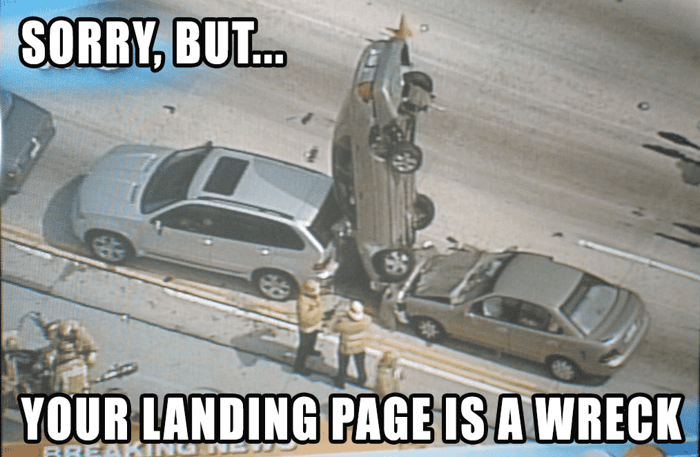
Sometimes it’s hard for us to admit that something is broken. (image source)
Last week I made the decision to sell the first car that I’ve ever owned. It’s caused me and my wallet some grief, and even though it’s a great car, I knew that I needed to find something a little bit more reliable.
Strangely enough, the entire process has been extremely emotional for me, and has made it very difficult for me to sell it. I’m not a car person or anything, but I love my little silver Acura!
Often we encounter a similar emotional attachment to our ideas and creations in the design world. We put our time and efforts and ideas into one finished product. Well, I’m here to tell you that some of the landing pages that you make are broken, and will probably need to be gotten rid of, just like my car.
Don’t worry, though!
This experience will bring you greater results, and with the help of analytics, you’ll be able to see the reward of trashing some of your failed ideas. Soon enough you’ll be riding in your next dream car! Here’s 3 things that might sound like good ideas, but are possibly holding your website or landing page back.
Use Headlines that are Clear Instead of Clever
Not all of are pun artists, but I think that most of us love a good turn of phrase. We especially love them when WE come up with them. Cleverness alone does not necessarily make a good headline.
Imagine you go to the store to buy shampoo for dry hair. There’s a display on the end of the aisle that says “Just Right: Sure to make your goldi-locks shine brighter than they ever have before!” [I know that it’s not even that clever, but bear with me (yesss, accidental bear/goldilocks pun)].
You turn the bottle around, but nowhere on the bottle does it say what it actually is. Is it conditioner? Hair serum? Whatever it is, you’re not going to be buying it because you came to the store for shampoo.
People feel the same way when they are on your landing page. They are looking for a very specific service or product, and you have seconds to convince them that your site will provide a solution. In fact, UsabilityHub provides a tool that can put your landing page through a five-second test with strangers. Give it a try here.
Instead of using cleverness, grab your audience with a benefit-driven headline.
Get Rid of Rotating Banners & Image Sliders
Rotating banners are really popular on websites right now. They give you the option of having multiple hero shots and advertising different things at once. You can even choose how you’d like the slides to transition into each other!
Except, you shouldn’t use them.
These guys are conversion killers. Wider Funnel, Site Tuners and ConversionXL all have articles about this phenomenon.
The fact is, image sliders are largely ignored by a user. There might be some interaction with the very first slide, but it’s very low success rate. You’re better off choosing one message and offer to focus on, especially when making a landing page.
Cut Out Extra Worthless Words and Jargon
I think all of us want to impress our potential customers. We’ll describe our new product or service with phrases like “world class,” “cutting edge,” and “innovative technology.”
Are these phrases really effective in convincing people to use your product? Probably not. All of your competitors are also using these phrases, so they’re just cluttering up your website and landing page with worthless words.
Instead, present why your product is the next best thing. If it really innovative, revolutionary or game changing, let them be the one that says it. Companies like Coin and Nest are really great at this. They use video and simple short language to explain what their product does, and it works.
If you want to read more about what language you should avoid in your copywriting, check out this sweet article by Unbounce.
In Conclusion…
All of us want to be up to date with the times and be the most clever person in the industry. It doesn’t always work, though, especially with landing pages. Hopefully these three tips will help you trash your old landing page clunker and exchange it for the fastest and slickest landing page your industry has ever seen.
Want more ideas on how you can improve your landing page? Here’s 5 Ways to Improve Your Landing Page Today.
And if you’re itching to read something a bit longer, download our landing page guide! Seriously. I worked really hard on this thing.

