
by Allison Otting • March 25, 2014


What Does a Great Real Estate Landing Page Look Like? (with Examples)
When it comes to online advertising, having the right real estate landing page can make all the difference. After all, getting the right traffic to click on your ads is great, but if those people don’t end up on a page that convinces them to reach out to you, what’s the point?
In many ways, creating a real estate landing page is a lot like staging a home. If you include the right design elements and emphasize the right selling points, people are a lot more likely to buy.
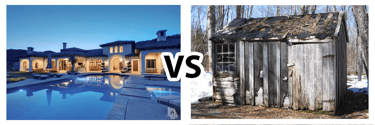
Just like landing pages, one of these houses is going to lead to more revenue. Is your landing page looking more like a shack or a mansion? (image sources)
My mother loves shows about houses, whether they’re about cleaning houses, renovating houses or selling houses. She just finds it fascinating how these interior decorators and real estate agents take something drab and turn it into a space with more function and beauty than the owner could have dreamed of.
Updated March 30, 2017
After watching some of these shows with her, I started to wonder, if real estate agents can optimize a living space for the most interest and highest price, how does the home industry do with optimizing their web marketing?
I’ve scoured the web for ads for “selling my home” and in this article, I’ll take you through a few landing page examples that will point out some optimization wins, as well as some major fails.
Keller Williams Realty – Utah County

What will sell?
- A real person! It’s nice to see who is going to help you sell your home! It helps with your credibility.
- Current work: SuAnne has included eight of her listings. This indicates that she knows what she’s doing, and she has certainly done this before.
What’s hurting conversions?
- Too many links: Every link that doesn’t lead to your conversion goal is a leak, and this site has a lot of links. This is a homepage and not a landing page. You should really use landing pages with your PPC campaigns to minimize leaks and increase conversions.
- Message mismatch: I searched “sell my home,” and the headline says “We’ll get it sold!” but what is the form for? To search for homes to buy, not sell! Farther down the page you can find information on selling your home, but no one is going to stick around long enough for that.
- Three CTA buttons: What are we supposed to do with that? Which one do you click? Also, you need to always make your CTAs high contrast so that they stand out, otherwise they don’t stand a chance.
What would I do?
To properly stage this landing page, I would take away all the extra links and make a dedicated landing page to selling your house. It might also be a good idea to create a lead-gen form with only one CTA and provide a headline and some information above the fold that is targeted to what searchers are typing in.
I Buy Utah Homes – Salt Lake County
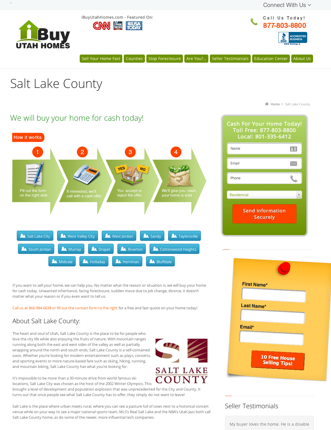
What will sell?
- Clean and sharp design: The images and design of the landing page look like they’re all made by the same person! Bravo.
- Credibility indicators: At the top they mention that they’ve been featured on CNN, USA Today and Fox News. This small inclusion can really reassure a customer that you are the real deal.
- Step by Step process: People like to know what they’re getting into, or what happens next, so the 4-step infographic on this page is a great idea. Plus, did you notice that it also serves as a directional cue towards the form? Nice work!
- Testimonials: They’ve put several testimonials on a slider, and these will almost always persuade a customer to convert.
What’s hurting conversions?
- Multiple lead-gen forms: I already mentioned the too many links problem in the previous site, but this site suffers from an even bigger conversion problem: there are two different forms for two different things! Not to mention that the second one is orange, which draws attention away from the first. Also, while I appreciate the fact that they want the customer to know that their information is secure, I’m sure they can come up with a better call-to-action than “Send Information Securely”
- Vague headline: “Salt Lake County” doesn’t tell you much about what the page is for. The sub-head helps a bit, but the headline should be all that someone needs to read to tell what the page is about.
- Unnecessary copy: Information is good. It banishes the fears and impediments from someone converting, but information should never just be inserted to fill up space. Why would the person who wants to sell their house in Salt Lake County want to hear about how awesome Salt Lake County is?
What would I do?
Again, I would take away the navigation links: they’ll only make you lose people. In addition, it would be a good idea to write a solid headline that mentions selling your house, along with a benefit of selling your house through I Buy Utah Homes. If you need help writing a headline, look at what your customers are saying in your testimonials.
I would also combine the two lead-gen forms into one. Offer the selling tips as a bonus gift (people love those) and make the form stand out a bit more so that no one could miss it. You can remove all the information about Salt Lake County, and then move those very precious testimonials up!
Fast Home Offer
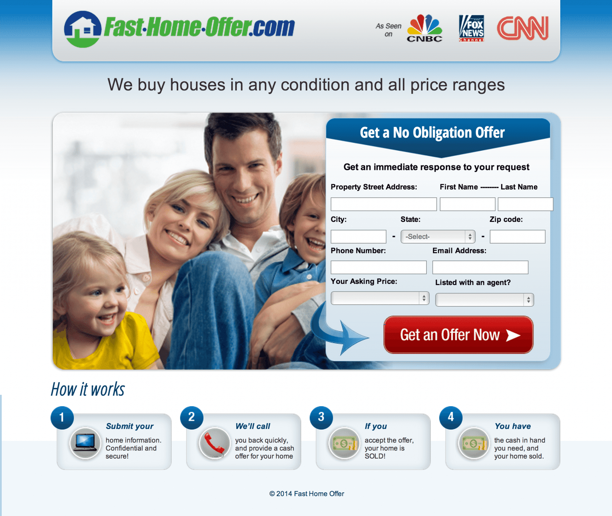
What will sell?
- Credibility indicators: Like I said, this always helps! Especially big name news sources.
- Solid headline: This headline tells you exactly what they do, and what you can do on their page. Not perfect, but a great start!
- Lots of directional cues: This page has an arrow at the top of your lead-gen form, as well as one leading to the CTA button. This tells people exactly where to go and what to do. Also, note the arrow within the CTA button. It’s a small thing but we’ve found that it can boost conversions, so it’s always worth an A/B test.
What’s hurting conversions?
- Is there enough information? The lead-gen form asks a lot for so little information on the page. Would you 100% trust it? When is short and sweet too short?
- Weird headings: Did you notice that the little headings for the four steps is the beginning of each sentence? This is problematic for people skimming the page who wonder what “If you” and “You have” mean.
What would I do?
I really like this page, so I wouldn’t change a ton about how it’s structured. I would make those little headings actually descriptive of the process for easy content consumption, and then maybe expand the copy a bit more. I would also add some testimonials if possible.
In addition, there’s lots of things that you could A/B test on this: Long form vs. Short form or maybe a two step landing page vs. a one step. I think this is a pretty good launching point, though.
In Conclusion…
Real estate agents can stage a house for sale, but some of them might need help optimizing their real estate landing pages. Looking at landing page examples gives us a great opportunity to critique and learn how we can help our own, no matter what the industry is.
By the way, if you’d like any help staging your own real estate landing pages, let me know here or in the comments. I’d be happy to take a look at your page(s) and give you some feedback.
What are some of your favorite examples of real estate landing pages (good or bad)? Do you have any suggestions to add?


