
by Brad Witbeck • February 20, 2017


How to Design a Nonprofit Website that Converts
So, your organization has a cause and a nonprofit website you hope will inspire people to take up your cause. Hopefully, you also have a Google Grant, so your website is getting decent traffic.
This is all well and good, but it isn’t enough. If you want people to take action you need a well-designed website.
After all, it’s not enough to simply spread the word about your cause—you need people to actually do something.
Fortunately, a well-designed site will turn visitors into doers. All you have to do is set up your nonprofit website in a way that encourages people to act. Here’s how:
Keep It Interesting (For Your Audience)
It’s a lot easier to get people to do something if you’ve captured their interest. There are a few different ways to do this for a nonprofit website, but some of the easiest are to use pictures and videos,
Use Pictures
A picture really is worth a thousand words, so you’ll be able to say a lot more in a lot less time simply by using the right pictures. Find pictures that evoke something about your cause, that tell a story about what you’re trying to do. If you have a site that is focused on improving literacy rates for example, perhaps design your site to show pictures of children reading.
For example, check out this page on the Reading Partners website:
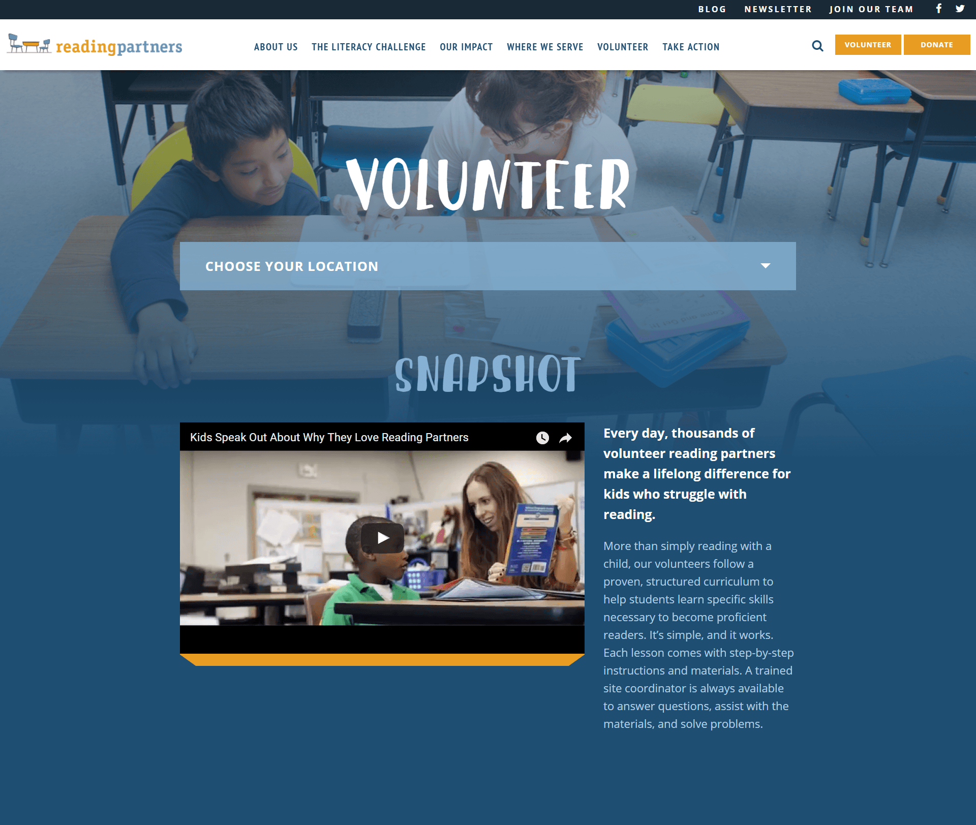
Simply by looking at the picture (or even the video frame), you can immediately tell what Reading Partners does—it connects students with reading mentors.
You can use pictures as the full background of sections of your page (called hero shots) or you can feature images that go with certain reading material that is particularly important. In the case of Reading Partners, the hero shot is the picture of the child and mentor at the top of the page.
No matter what kind of pictures you use, you’ll just want to make sure that you’re using pictures that catch attention and tell a story.
Use Statistics
In addition to pictures, statistics are another great way to keep things interesting. Numbers stick because they are concrete and easy to understand. More importantly, they can change people’s perspectives on your issue.
Along with the statistics themselves, if you can find a visual way to represent your data, that will make if even more impactful. It’s like using pictures, but telling the story of the numbers that are important to your nonprofit business.
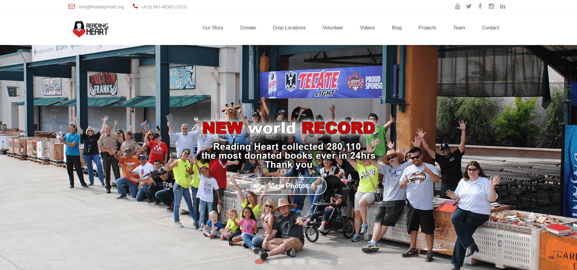
For example, here Reading Heart gives a statistic (280,110 books donated in 24 hrs) and shows a picture of all the books. It’s easy to see from this image that Reading Heart is very committed to collecting books for their mission.
Statistics can also serve as a good hook into your more relevant information, helping people realize why they might want to read more information. Put only as much as you need to on your homepage or any of your landing pages, and save the longer amounts of text for other pages (like blog posts).
Think about it, if you had seen these paragraphs I’m writing here just on the main page of a website, would you have stopped to read them? Even if you’re interested in learning more about website design for nonprofit businesses, you’ll probably just look to find information like this in a blog post or an eBook.
Use Emotion
Emotion is the key to rallying people to your cause, so if you can evoke emotion on your nonprofit website, you’ll help people feel much more interested in taking action. There are a few different ways to achieve this.
For example, stories can be quite compelling and can help people personalize the cause that you’re working on. Where statistics can give a macro view of what’s going on, people can get an idea of the reality of the need for your cause through more individual stories. These can be great for blogs too.
Now, on top of all of these things, if you have the means to make one, get a video on your page. Videos have the advantages of both pictures and stories. On top of these, they can have music. Music does a great job of getting people’s emotions involved too.
Take this video ad, for example. Notice how they use the music to help connect people to the cause.
The right pictures, statistics and/or emotion will make your nonprofit website much more compelling. The more compelling your website is, the more likely people are to take action and support your cause.
Match Ads To Landing Pages
As you work on making your website more compelling, it’s important to keep the expectations of your target audience in mind.
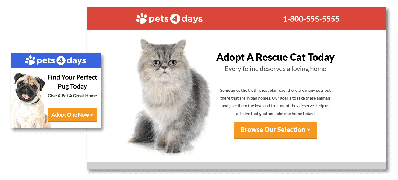
For example, what if this pug ad led to this cat webpage? The messaging of the ad doesn’t match the landing page at all. If you clicked on this ad, wouldn’t you feel a bit confused by the page?
Most nonprofits send traffic from their ads to their home page. While this isn’t necessarily bad, your home page has to meet the needs of everyone who visits your site, which means it really isn’t that good of a fit for anyone.
Since people who click on your ads come to your page with a specific idea in mind, you will get the best results if the page they land on (the “landing page”) meets their expectations.
Ensure that your landing pages are clear and concise, connected to whatever ad leads to them, and have a concise call to action—usually a button that lets them fill out a form so you can stay in touch with them by getting their email.
Basically, your “landing pages” should be tailored to the needs of whatever portions of your audience will be going to them. That way, when they click on your ads, they’ll end up on a page that gives them exactly what they’re looking for.
Use a Good Call To Action
You know how you probably signed up for Uber even though you’ve never used it? It’s because Uber has great calls to action. A call-to-action is that button you see on most websites that tells you what to do next (“Donate”, “Volunteer”, “Sign Up”, etc).
The more specific your call-to-action is, the more likely people are to take action. For more recommendations on how to create a great CTA, click here. If you have CTAs that your potential customers can’t help but click, you’ll be in a really good place.
Conclusion
There are a lot of things you can do to optimize your nonprofit website, but the guidelines in this article should help you get a lot more value out of your website.
By the way, if you’d like me to take a look at your website and give you some specific recommendations, let me know here or in the comments. I’d love to help you and your nonprofit organization succeed online.
How do you make the most out of your nonprofit website?


