by Brad Witbeck • May 10, 2017
No One Knows What You Do! (and How to Fix That)
Has anyone ever asked what you do?
Have you ever had trouble answering?
Have you ever tried to show them, say, on your website, and they still came away confused?
Amazingly enough, this happens all the time. I recently audited and categorized over 1,000 websites. Well, at least I tried to categorize them. Of the hundreds of sites I audited, approximately 18% had a home page that made it immediately clear what their business did. The rest… left me scratching my head.
What’s more, I even had other people check just to make sure I wasn’t missing something obvious, and they were all left confused too. In most cases, it took us 10-15 minutes of digging through the site, watching videos or even looking the business up on Bloomberg before we could figure out what the company actually did.

While this was certainly a frustrating exercise for me, it made me ask the question, If it took me that much effort to figure out what these businesses did, how many potential customers did these sites lose to unclear messaging?
On top of that, why was their messaging so unclear?
Let’s talk about some possible reasons why, and how to fix them.
So Many Words, So Little Meaning…
If there’s one thing I noticed about the 1,000+ websites I visited, it’s how much businesses like to talk about themselves. Every company loves to talk about how awesome they are, how cool their features are and what makes them unique.
Unfortunately…

People don’t come to your site to read about how cool your business is. They come to your site because they want to know how you can help them.
So, instead of using flowery terms that have multitudes of meanings to describe what your business does, just come out and say it!
Seriously, you will get more of the customers you want when you actually tell people what you do. Unless you do something that no one wants, but that’s a completely different problem.
SOLUTION: Just Say It!
Some of the best sites I looked at showed exactly what they did in clear terms. They had clear headlines. They had succinct explanations. They were freaking beautiful.
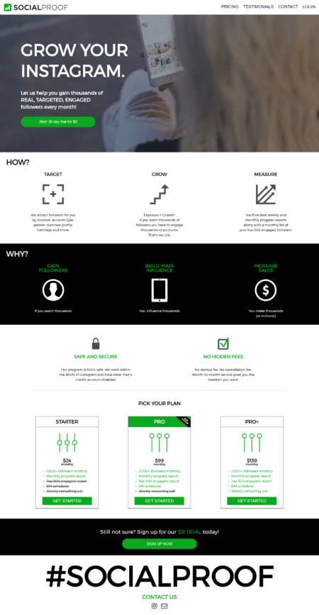
As an example, take a look at Social Proof’s homepage:

Even if you don’t know what they do by the name of the site, you know exactly what they do by the end of their headline “GROW YOUR INSTAGRAM.”
There. That took 3 words.
But it gets better.
Not only does their subheadline elaborate with more powerful wording, they then go on to tell you everything you would need to know with 3 icons for How, and 3 icons for Why.
This page is remarkably well put together, and anyone who is looking to grow their Instagram (and is willing to pay for it) will likely end up using their service.
SOLUTION: Get to the Point
Another thing that Social Proof has done well is to make their home page their “elevator pitch.”
An elevator pitch is basically what you would tell a potential investor if you ran into them on an elevator. How would you describe your company to them if you only had 10-30 seconds?
The average site visitor only stays on your site for about 10 seconds. Even if they see a value proposition, they’re only likely to stay for about 20 more seconds.
So there you go.
You’ve got 30 seconds (tops). Make them count. Don’t dither on about details that can be explained in a sales call. Tell them what you do and why they should be interested…and that’s it.
You Made This All By Yourself, Didn’t You?
Just because you poured your heart and soul into your site doesn’t mean it’s perfect. Everybody makes mistakes and the more time you spend working on something, the less you tend to see the mistakes you’re making.

In my audits, it was clear that many sites were confusing because they hadn’t had enough proofreading to make sure they made sense. Whoever set up the site may have proofread for spelling errors and readability, but certainly not for content.
Too many of the sites I saw used jargon that was undefined, had way too dense of copy, and buried what it actually was that they do. Many sites were put together almost like they were trying to cram as much information onto their homepage as they could get. Other sites would talk in circles about why they were the best at what they do, but they would never actually say what exactly that was.
The sad truth is, a little proofreading would have made a world of difference.
SOLUTION: Get Some Eyes On It
If you want to know whether or not your content needs some editing, ask someone who has never seen your site to look at your page and tell you what your business does.
If you’re wanting to raise the stakes, see if they can figure it out in under 10 seconds.
If they can’t at least tell you what your business does in 10 seconds, you need to make some changes.
The best way to get around this is by keeping your value proposition clear in your headline. Don’t focus your home page on some event you have coming up (unless that’s the core of your value proposition). Just make it clear what it is you do.
And it doesn’t always have to come from your copy.
For instance, if you were a company that sold water purifiers and you had a headline that says something like “Pure water for a pure life” on top of a picture of a waterfall, people might wonder if you’re just really concerned with the environment. However, putting a picture of someone using one of your filters would show your potential customers what you sell.
If you want to make it even better, add a call to action button that lets people buy your product without having to look further. That way they know you’re an eCommerce site. If they have no cart, and no clear places to look to place an order, they’ll probably never know exactly what you do because they’ll go with a competitor who is more clear.
So be clear. Which brings us to our next point.
I’m Sold, Now What?
The final common problem I saw on many of the sites I audited was either an unclear call to action, or none at all.
Why?
I don’t know.
If there is nothing else you take away from this article, please let it be this.
No matter what it is you do, it is useless if it doesn’t affect people in some way. Whether it’s a blog where people can “subscribe” or a dental office where people can “book an appointment”, the point of your website is to get people to take action.

So how do you do it?
SOLUTION: Just Do It
Seriously.
Just put in a call to action.
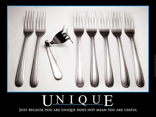
It doesn’t have to be clever, just clear. Cleverness can come later. In fact, trying to be too clever (just like trying to be too unique) can make for more trouble than it will solve.
You know how you miss 100% of the shots you don’t take? That principle applies here. Having no call to action means your site can’t really make an impact on your customers.
Take a look at other sites and see what sorts of calls to action they have. If you’ve ever made a purchase from a site, or subscribed to a site, take a look at how they got you to do that.
Where did they place that call to action? What color was it? (likely contrasting from the rest of the site). What did it say?
See how you can take principles like that from the sites you’ve liked, and then apply them to your own.

It will make all the difference.
CONCLUSION
Your homepage is your audience’s first impression of your business. If they can look at it and know exactly what you do, you’ve won. If they end up scratching their heads and (heaven forbid) going to Bloomberg to figure out what you do, you’ve lost.
To create a winning site, have some people you know look at your site, and see if they know what it is you do within 10 seconds.
If they can’t, make sure that you turn your homepage into an elevator pitch. Get down to the basics of what you do and feature that content.
If all else fails, at least have a clear call to action. Something that says “Buy Now” or “Get My Free Consultation” will inform your audience so much more than “Click Here.”
You have a whole website where you can put extra info if you want to. For your homepage, keep it to what your potential customers or clients need to know.
What do you think of this advice? Is there anything you would add? What are some sites you’ve seen that you thought were great examples of a good first impression?


