
The Legal PPC Landing Page Battle – With Critiques
by Sarah Rodriguez


Are you making these crucial mistakes on your legal ppc landing page?
As a lawyer, you have to carefully sort through your information and present it in an effective way. A legal case outcome can dramatically change if poorly executed. Even with incriminating evidence and enlightening info, presentation is everything. The same is true for your legal ppc landing pages.
There are ways to effectively present yourself in the form of landing pages to persuade visitors to convert. I spent some time researching law firms and legal consultants, specifically their landing pages, and will go through individually what is working and what is not.
Weyher Fulkerson – Utah Legal Counsel
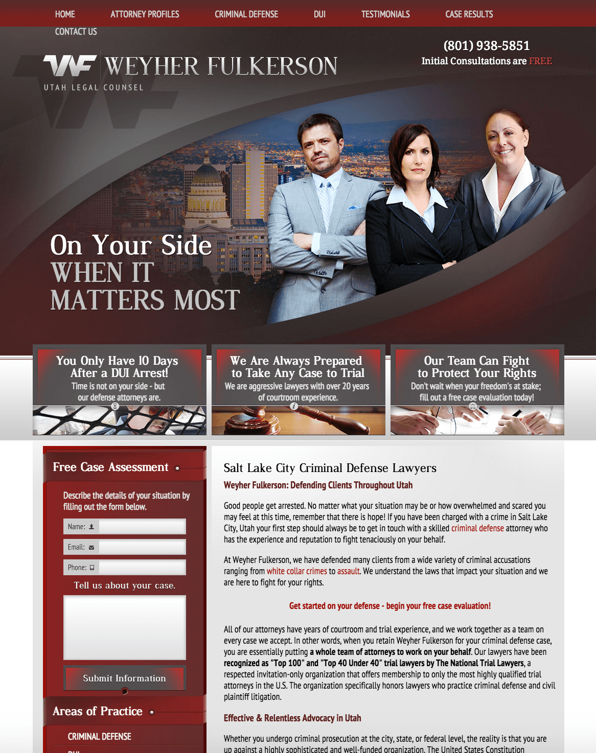
Let’s take a look at first impressions
What Will Sell?
Visual Appeal: When I first saw this landing page I thought, “This is a good looking page!” And although we know looks aren’t everything when it comes to conversion rate optimization, this page is off to a great start with a good hero shot and above-the-fold layout.
Headline & Logo: By taking a quick glance at this page, the visitor is able to figure out who they are (“Utah Legal Counsel”) and what they will do for you (“Fight on your side”)
What Could Be Hurting Conversions?
Call-To-Action: At first glance, its hard to find this page’s call to action. There is a small indication of a free consultation near the top of the page but no active call to action. Plus further down at the form, they are promoting a Free Case Assessment.
Even if a Free Consultation and a Free Case Assessment are the same thing, you should keep your Call to Action’s uniform throughout your page. You don’t want to miss a conversion because your audience might be confused about what they will be getting.
Lack of Focus: There are too many navigation links (potentially leading your visitors away from the page) and info that seems very general.
[Tweet “Keep your #PPC landing page clear with a single call to action (CTA) for better performance”]
What Would I Change?
- First things first, create a strong call to action and make it uniform throughout the page. “Get Your Free Consultation Now” or “Get Your FREE Case Assesment Today”.
- Get rid of outside links, even if its to your own homepage or social media accounts. Any links away from your landing page will cause a loss of a potential conversion, and we don’t want that, do we?
- Narrow your Focus: Who is your target audience? What info will be most important to them? Many people are going to scan through your landing page to find the info they need so make it easy for them to find it.
Kelly Ann Booth – PLLC
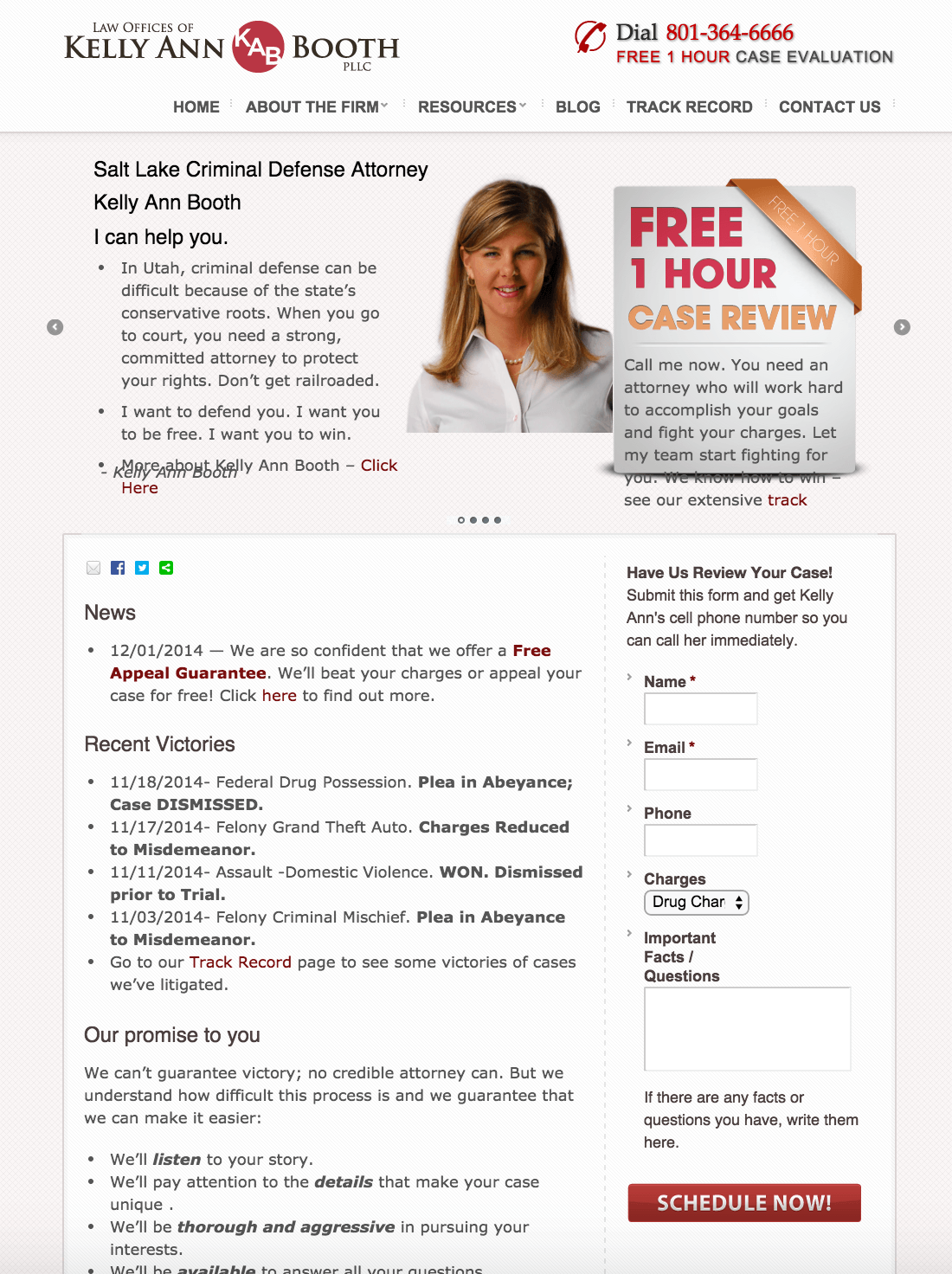
Great idea with the “Recent Victories” portion!
What Will Sell?
Call-to-Action: When you first see this page, you know that you can schedule a free 1 hour case review. It’s by the phone number, by the headlines, and on the form. A strong and uniform call to action will encourage visitors to act.
Who You’re Working With: With certain industries, such as law firms, that deal with sensitive issues, its good to show a visual of who you will be working with. It boosts credibility and helps to build a stronger connection with your audience
What Could Be Hurting Conversions?
Cluttered and Disorganized: Although this page has some very good information, it looks a little messy. You might notice under the “Free 1 Hour Case review” the text is spilling down below the box. There is also some funky line spacing at the bottom the the about bullet points. This could be hurting conversions because its hard to read and hard to follow.
Subtle Form: Because this page does not contain a lot of color, when the form is moved off to the side, down below the fold, the same color as the rest of the page, it doesn’t stick out. There are no indicators (border, frame, arrows, contrasting colors) that show the form is what you should be focusing on.
What Would I Change?
- Give the page a little more breathing room. Break the page up into sections that are easy to browse and follow. Avoid unusual formatting issues in text or headlines that might make it harder to read.
- Do something to the form to make it stand out. Move it up higher on the page, add a colored border, or a button that really draws your attention.
- Remove those social links! Don’t take people away from your landing page.
[Tweet “Remove as many outbound links as possible from your #PPC landing pages”]
The Kleyman Law Firm – New York Family Law Practice
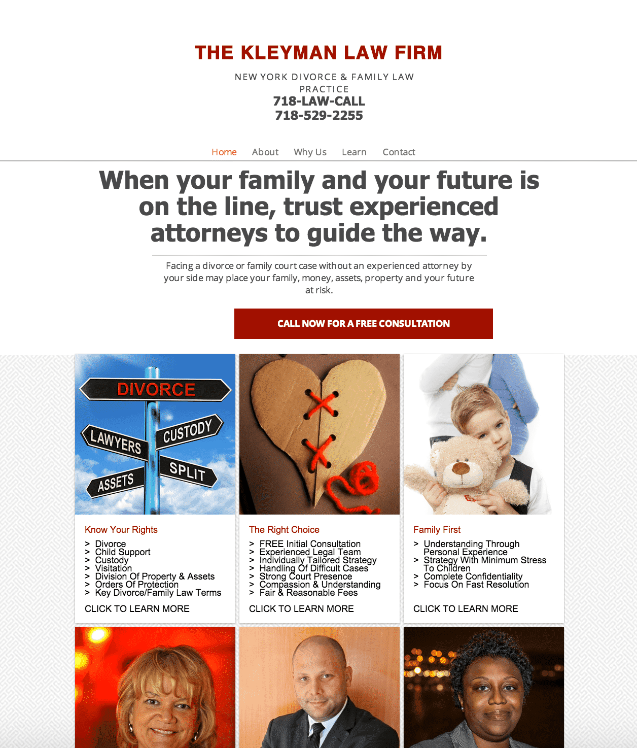
Too many competing visuals and call to actions
What Will Sell?
Headline: The headline actually does a good job of saying who they are, what they do, and how they can help you. A strong, clear headline is very important when it comes to conversion rate optimization.
Offer: Many people want something in return for giving you their personal information. This page offers a free consultation which is a good way to persuade a conversion.
What Could Be Hurting Conversions?
Hero Shot: My first reaction to this page was that it seemed very stiff and cold. There is no visual to help show what you are trying to sell. A hero shot can also help to evoke emotional responses within viewers that can help drive conversions.
Lack of Information: Again, this comes down to a matter of audience focus. Find out who your audience is and give them the information they will need. This page only offers more information once you decide what you think you need and click a link. That is two extra steps that your viewer needs to take just to find out if this is even what they are looking for.
Boring: There is very little visual interest on this page, no natural path for your eye to follow. This can be overwhelming to visitors and seriously hurt your conversions.
What Would I Change?
- Add a hero shot of some experienced lawyers, a happy client, or even a photo that would evoke an emotional response. Especially when dealing with divorce and family issues, this is a great opportunity to emotionally connect with visitors and make them feel like you will take care of them. A good hero shot can also help to add additional interest and provide information to your visitors.
- Try changing the color of the CTA button so that it stands out. Don’t let your audience miss your one goal, CLICK THE BUTTON!
- Find information that is relevant to your client and add it to the page so it’s easy to navigate and search through. Add some visuals like icons, photos, or charts which are easier to scan over than overwhelming amounts of text.
So what have we learned?
Lawyers can be really good at presenting their cases in the courtroom, but not all lawyers are able to present their “case” on a landing page.
Looking at some quick examples of what law firms and legal consultants are doing right and what they are doing wrong on their legal ppc landing pages, hopefully you can use some of these techniques in your own landing pages, legal or not.
Want more info about how to optimize your landing page? Keep reading through our blog for tons of tips on conversion rate optimization!


