
by Allison Otting • July 15, 2015


I Can’t Read Your Site: 5 Legibility Rules For Landing Pages that Convert Better
Do you remember Space Jam? The 1996 movie about the Looney Toons teaming up with Michael Jordan to defeat a bunch of aliens who had stolen the talents of other NBA players in a game of basketball? Anybody who’s seen the movie will probably agree that it’s a modern classic. But, do you know what’s not a classic? The Space Jam website. Well, at least not as an example of modern web design.
It’s definitely a product of its time (which is a nice way of saying it’s really ugly). One of the biggest problems is the text: if you click around the site it’s hard to read and downright headache-inducing at times.
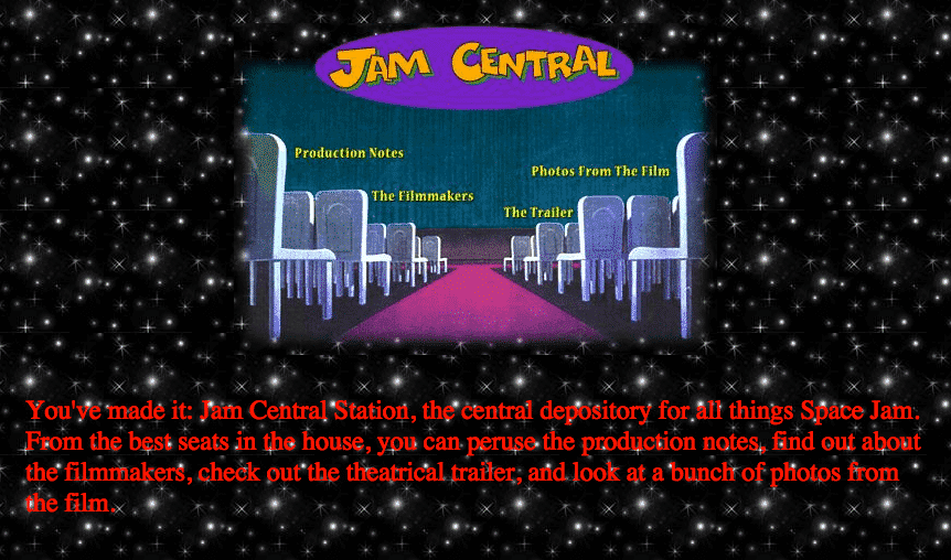
Still, if you’re looking to build a web site or a better landing page to convert visitors in 2015, there are a few things you can learn from the Space Jam website. One of the big things is legibility: something that’s hard to pin down but can cause users to bounce if it’s not done right. Reading is such an important part of our online interactions, but time and attention spans are short, so if there’s even a little bit of friction your users will move on to your competitors.
So let’s talk about 5 rules you can implement today to create clean, legible, and better landing pages.
1. Don’t make your text too big or too small.
This might seem obvious, but I see landing pages break this rule all the time. There is an epidemic of giant type in 2015! Your user should never feel like they have to hold their device farther away or closer to their face just to read your site. Here are two things to keep in mind:
People hold mobile devices a lot closer to their eyes than computer screens.
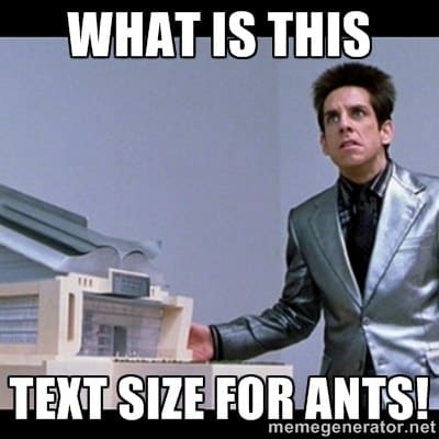
It might seem tempting to make your text giant for mobile users, but they’ll make do with about 16px copy or even a tiny bit smaller. This is important to pair with a mobile optimized site, though! Your text could be 36px and still look like it’s meant for ants if it’s loading a desktop page onto a tiny phone screen.
Use giant text sparingly.
Sometimes it’s really useful to make a big impact with two words at 72px, but generally it’s going to create a reading problem on your landing page. Adult readers usually don’t read each word at a time, but rather recognize shapes of words and skip around to read quicker. When you have a long headline in giant text, you’re forced to slow down because it’s suddenly not as easy to take in all at once.
For example, this site is using 36px font for its headline, but because it’s so large and so long it gets tiring to read very quickly when it’s filling your entire browser.
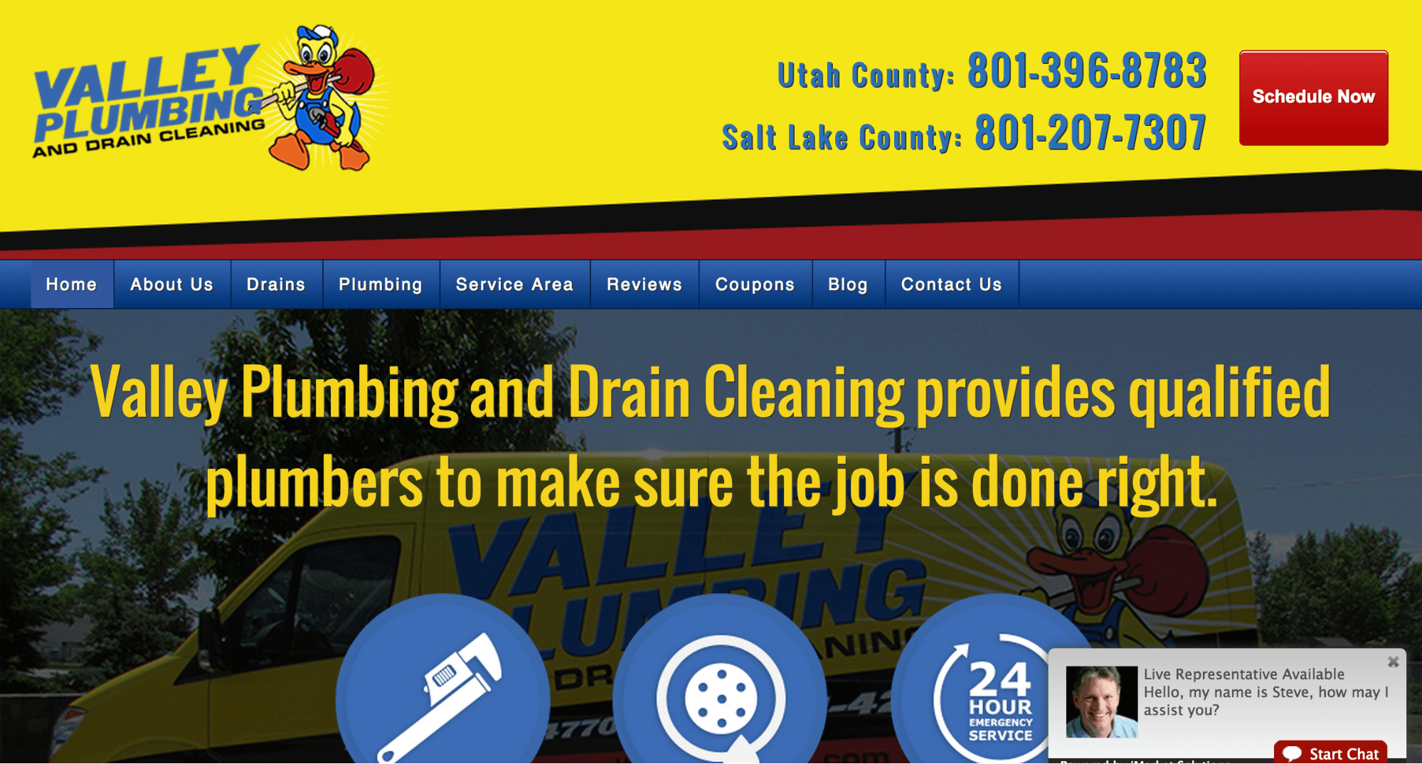
I might have tried “Plumbing and Drain Cleaning done right” with a supporting smaller subhead instead. Appropriate text size makes for better landing pages!
2. Be careful when you put text over images.
One of the biggest landing page (and website) trends right now is having a huge photo for a hero shot, with headline and supporting text on top. It makes for some good looking pages, but it can occasionally cause some legibility issues. Let me give you an example.
We have a client who wanted a good family picture, but it had to make sense with family law disputes (such as custody and divorce). We found one, but it left very little room for our headline.

We ended up having to photoshop the photo a bit, and tuck the text into the corner to try and make it slightly more legible.

This turned out to be not the best solution. The picture looked nice, but the text was treated like an afterthought. We tested this page against a variant that put all the text against a solid background, and it converted 45% better.
For another client, we put our headline text on a dark transparent box rather than straight on the picture. It contributed to a 24% boost in conversion rate. You should never sacrifice the legibility of your text by putting it over an ill-fitting image.
3. Text on white is easiest to read
Books are printed on white paper. Most news websites have white backgrounds. Our eyes are used to reading dark text on a light background! It’s proven that white text on dark backgrounds can strain our eyes after a prolonged period of time. As a result, body copy should be kept on lighter backgrounds.
The effect of white text can be used to your advantage, though! Headlines and shorter emphasized text can benefit from being set on a dark background. UX Movement talks more about it here:
“Using white text on a dark background for these types of text is an effective way to highlight them to get the user’s attention. This is because white reflects all the colors of the visible light spectrum into the eyes. This makes the text bright and distinct.”
4. Avoid reading fatigue
There is a typography rule that a line of text should never be longer than 50 to 60 characters, otherwise you risk running into reading fatigue. Some people have also said that 75 is acceptable. The reason this rule exists is because our comfortable visual field is a couple of inches. After that we have to start moving our eyes and neck to finish reading.
The Web Style Guide by Patrick J. Lynch and Sarah Horton states:
“If the eye must traverse great distances on the page, the reader is easily lost and must hunt for the beginning of the next line. Quantitative studies show that moderate line lengths significantly increase the legibility of text.”
This guideline will be most useful for your body copy, but keeping your all your text line lengths to about 12 words a line will really make sure your potential customers keep reading.
5. Give everything breathing room
Print mediums have dictated the majority of typography rules, since websites weren’t exactly popular when printing presses and advertising first took off. When you’re working with print ads you have a limited amount of space, and you’re paying for every inch of space, whether you use it or not. I’m sure you’ve opened up a newspaper and seen an ad like this:
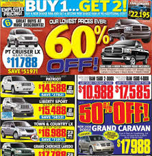
Newspaper ads are notorious for being crammed with information. Unfortunately, this quickly makes an ad overwhelming to look at and can lower the value of the brand (I talked a lot about this same principle in this post).
Luckily, you’re not paying for space with your landing page. You can make your landing page as long as you’d like, and more and more experts are saying that the fold is a myth. So, please give all your text and elements some breathing room in the form of whitespace.
Unbounce defines whitespace like this:
“A conversion centered design technique that uses areas of blank space to emphasize a landing page element of your choice. Whitespace allows you to direct attention to your call to action by giving your prospect’s eye only one thing to focus on.”
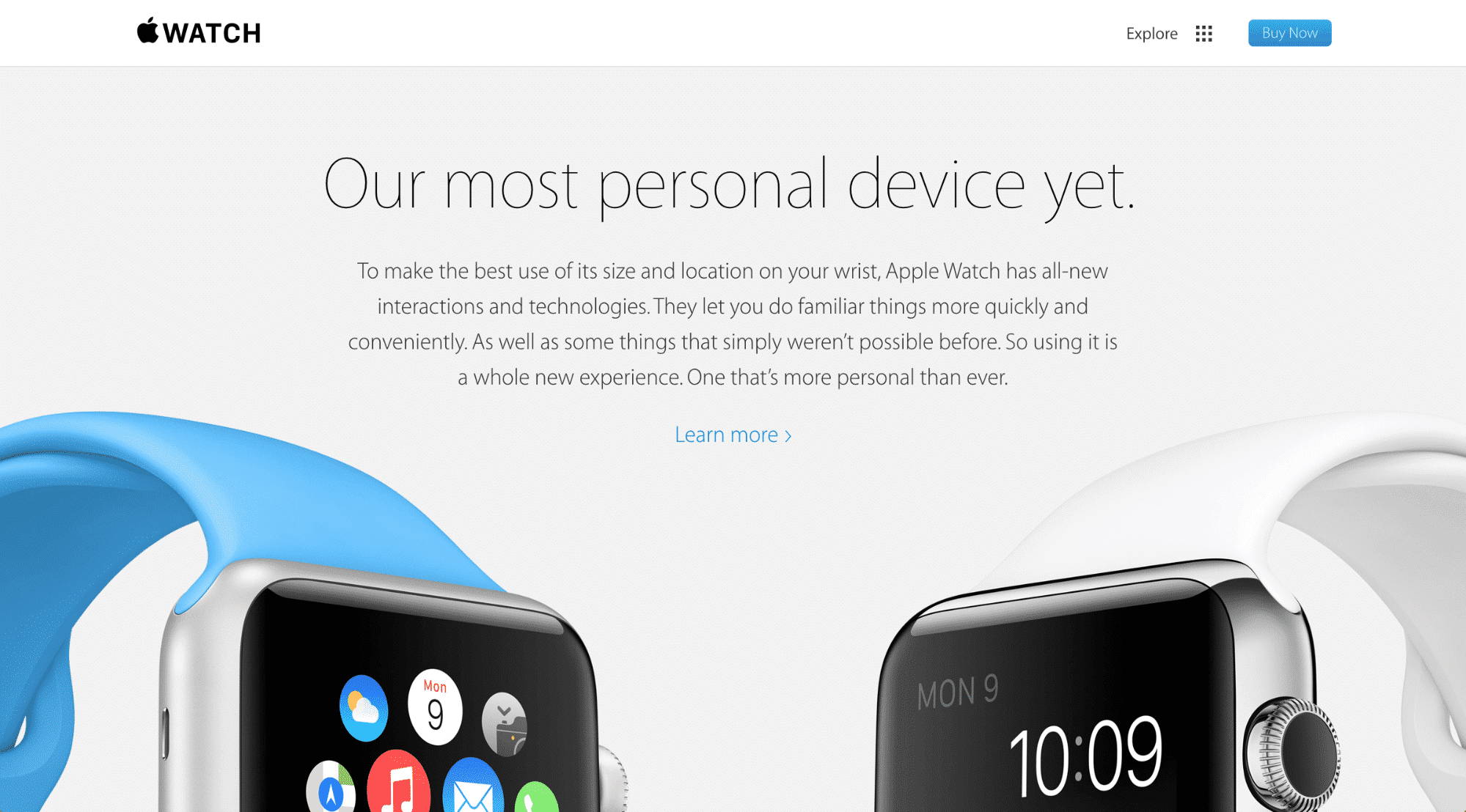
So, surrounding a block of text with whitespace actually draws more attention to it. Apple is one of the most notorious users of whitespace in their product pages. The pages are long, but the text is all legible and the product photos are so well integrated that you have no issue scrolling as far as they want you to!
Not only is whitespace useful as a marketing and design tool, but it makes your text much more legible. There are lots of articles on how it impacts design and how it can help your landing pages convert better.
Go forth and be legible!
There are plenty of other typography rules, but these ones are the main issues that impact user experiences and, and therefore conversion rates, on your landing pages. Did I leave anything out? Let me know in the comments!
Also, did you know that as part of our PPC management services Disruptive Advertises designs and builds custom landing pages for all our clients? We even offer standalone landing page design packages. Contact us if you’d like to learn more about how landing pages can get more conversions for your business!


