
by Casey Walrath • August 19, 2015


Get More Conversions By Shortening Your Form
When I’m out shopping and standing at the checkout line, do you know what’s annoying? Well, aside from being stuck behind a hardcore coupon-clipper, it’s being asked to give my name or phone number for some rewards program, survey, or rebate.
Why should I hand out my personal contact information just because I bought a bluetooth speaker from you, random company!?
Besides that, giving out my information takes time, and who’s got that nowadays when everybody is so busy?
For eCommerce, the situation is a little different because when you’re buying through a source like Amazon you can’t really avoid giving up your information. It’s the price you pay to shop online, although that information is saved with my login so I don’t have to re-enter it every time and think about how much Amazon knows about me.
Still, any time I buy through a site I’ve never used before I’m always just a little bit resentful at giving yet another company more of my information.
The Reality of Form Fatigue
More likely than not you share my reluctance with giving out your information. Even if you don’t, I’ll tell you this: a lot of your customers do. And that’s why you need to respect that when you’re gathering information about them on your web forms.
Luckily, doing so can also improve conversion rates in your landing pages! Let’s look at a few examples of how asking for different things on forms can affect conversion rates.
Longer Forms = Less Leads
For starters, this post from Unbounce.com has this to say about form length:
It’s all about balance. Your goal here is to balance conversions with the quality/quantity of the information gathered.
In general, I recommend to clients that they begin landing page tests by asking for as little information as possible on forms and expand from there as needed. It can be surprising how just one form element can affect conversion rates.
For example, we tested a client in the IT industry who had a simple Name/Email/Phone form. In order to introduce an email follow-up campaign we added a checkbox box to let customers know that they could expect an email. We even made it pre-checked to minimize friction.
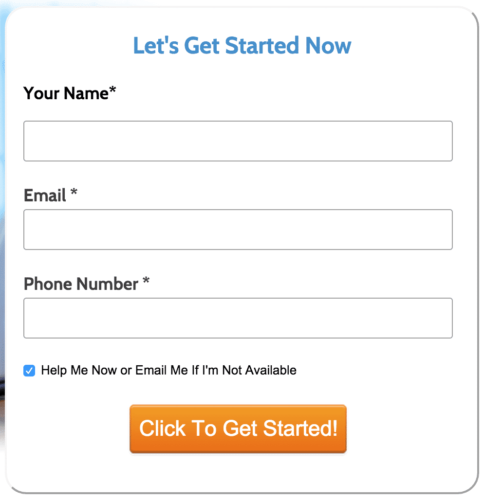
The results? Well, it didn’t work so well.
As you can see our sample included over 20,000 conversions, so we definitely had a large enough sample size, and that little inconspicuous checkbox dropped our conversion rate by 5 percentage points. That would’ve been good enough for over 1,700 more conversions.
As to why that happened, it’s a little bit guesswork without being able to ask the customers, but most likely the checkbox was just enough to create a little bit of doubt in the minds of a few more people. “Wait, aren’t I getting help already? Now you’re going to email me too!? Maybe this is a bad idea!”
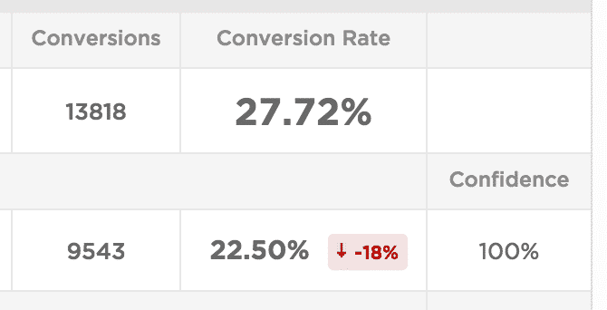
For another example of how a longer form increases friction, we had a client in the investment industry that wanted to pre-qualify leads so only people with a certain net worth signed up, so we added a checkbox that said “I certify that my net worth, including income and assets, is over $100,000.” They also wanted to confirm that the customers had read a specific legal disclaimer, so we added a checkbox for that as well.
However, two checkboxes made our form look long and intimidating, so I combined them into a single field that said something short and sweet like, “I certify that my net worth is over $100,000 and that I have read the legal notice posted below.”
Unfortunately, that specific test got wiped out (backup your data, folks!); but, from my memory, that change increased conversion rates by nearly 50% without noticeably affecting lead quality.
We also ran a test with no checkboxes at all, which more than doubled conversions, but client feedback indicated that most of the leads were unqualified, so they decided the tradeoff wasn’t worth it.
Where More Can Actually Be…Well, More
We’ve seen how shorter forms can be helpful; but, sometimes, asking for just a little more information can be useful.
For example, a client in the home repair service industry initially tested a form with Name/Email/Phone. Over time we added two additional fields for the benefit of the customer service reps: one for callback time and another for a short message.
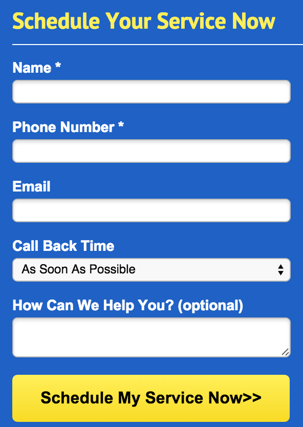
The result? These two additional forms didn’t affect conversion rates at all.
The Call Back Time drop-down defaulted to the most common response, “As Soon as Possible,” and we only had three other entries, making that field nice and simple. Meanwhile, we indicated that How We Can Help You is optional and kept the message field short to avoid intimidating customers and most of them took the time to fill it out.
In this case, slightly longer form fields added more authority and, critically, asked for information that benefitted both the company and the customer.
I’ve seen companies in similar industries go even further, asking customers to enter their zip codes, addresses, or to select specific appointment times. To me, that’s overkill: if you’re directing traffic from an AdWords campaign that’s using proper geo-targeting, and if the company closes leads by phone anyway, asking for too much information just increases friction.
Still, if you do want to collect that extra information, be sure to A/B test it so you know exactly how it affects conversions.
Another example of a Comments field not affecting conversion rates comes from our very own form on the Disruptive Advertising homepage:
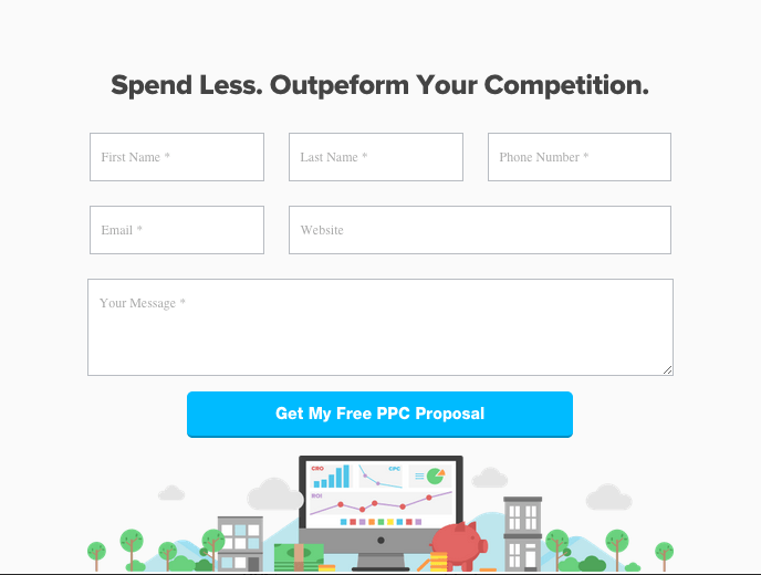
Still, there are a couple of things we should test: Would combining the First Name/Last Name fields affect conversions? What about making the Your Message field a little smaller, as seen in the earlier example? We could even test a vertically-aligned form.
Conclusion
In the end, the types of form fields that matter depend on the industry and the customer expectations. For any service that offers a quick response, less information is usually more. Don’t be greedy! If your sales process is to call back prospective leads, do you really need their email address? Or can you at least test not asking for it?
Meanwhile, in situations where the customer is less hurried you can get away with asking for a little more information—just be willing to test it out.
Hopefully this give you some ideas how to approach your website and landing page testing to get more conversions. Be sure to leave any questions or comments below; and, if you’re looking for a professional review of your Conversion Rate Optimization, let us know and we’ll review your web site and CRO strategy for free!


