
Get More Out of AdWords with the New Report Editor
by Jenny Hatch


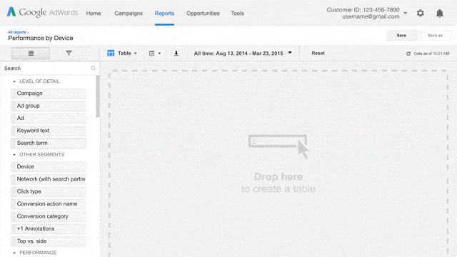
AdWords recently started rolling out their Report Editor. Within the next few months, it will be a main tab in everyone’s AdWords account (look for it between the Campaigns and Opportunities tab).
The Report Editor is an easy, visual way to explore and present account data both online and via downloadable reports. The interface is fairly simple—basically you drag and drop different aspects of your data to build custom tables and charts that can be filtered, segmented, and sorted to fit your needs.
The Reports
Report Editor has pre-defined reports and custom report options (learn how to access the various reports here) that fall into 4 categories: line, bar, pie and data. These custom reports allow you to combine multiple metrics in a variety of ways that make it possible to visually compare the metrics that matter most to your company.
Once you’ve got your report set up properly, you can save it or schedule it to automatically run at specified time.
Line Charts
Line Charts aren’t new to AdWords, but the Reporting Tab’s line charts present the data in a more useful way. You can still only look at data over time, but now you can compare more than two metrics at a time with the new line chart.
Bar and Pie Charts
Bar and pie charts, on the other hand, are completely new to AdWords. These new options are a great way to chart two metrics within a chosen segment (as a side note, most, but not all metrics can be compared to one another—for example, you can’t compare Search Impression Share and Device).
Data Tables
Data tables are a marked improvement on the previous tables you could use to export your data into Excel. You choose the metrics you want to compare, you can add filters and you can compare new data points that you previously couldn’t compare.
Impact
The new reports and report setup makes it a lot easier to get at and interpret your data. In particular, there are a few charts I’ve found to be very helpful:
Conversions By Hour
This helpful bar chart gives you an easy way to see how your campaigns convert at different times of the day. It’s a much easier way to get at this helpful data.
I typically run one report for the hour of the day and one for the hour of the week. You can also add another dimension like cost per conversion or conversion rate to the report to really break down how people interact with your campaigns at different times of the day.
This report easily shows which hours and days receive the most conversions, have the lowest cost per conversion and the highest conversion rate. I use this report to adjust my schedule in campaign settings so I can maximize conversions and minimize wasteful spend.
For example, in the image below I compared conversions and cost per conversion by hour of the day.
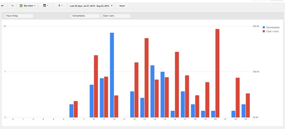
In this report, it’s clear that 10:00 am is when we receive the majority of conversions. 10:00 am also has a low cost per conversion. On the other hand, 8:00 pm is a terrible time for our ads. Not only do we get hardly any conversions, the few conversions we do get are incredibly expensive!
Using this data, it makes sense to increase bids at 10:00 am to get the most out of our peak conversion time and lowest cost-per-conversion. It’s also probably worth skipping the 8:00 pm hour to avoid paying a lot for very few conversions.
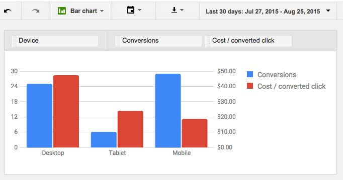
Conversions Across Devices
This bar chart compares conversions across devices, showing you where the majority of my conversions are coming from and which devices have the lowest cost per conversion. I use this report to maximize conversions by device where it makes the most sense cost-wise.
As seen in the image below, this client gets about half their conversions from desktop and half from mobile, but the cost per conversion on mobile is half of the cost per conversion on desktop. Clearly, there’s something about the desktop experience that needs improvement!
Conversions and Impression Share Lost
This bar chart allows you to compare conversions and search impression share lost by day of the week. Also, try lost impression share by budget (seen below) and rank. This chart allows you to see where you can increase your budget or increase your bid to increase the number of conversions.
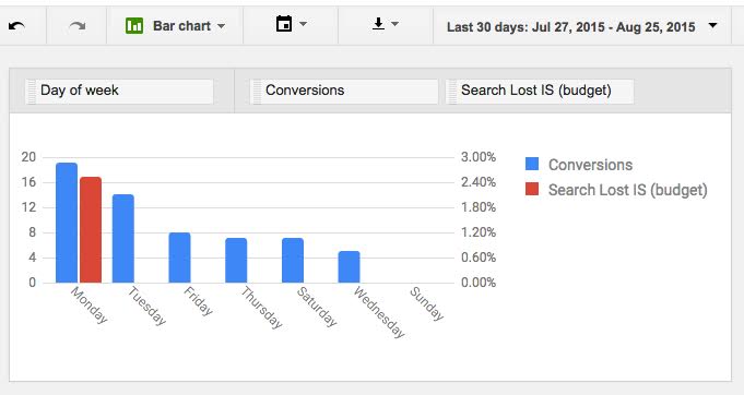
For example, here we’re getting more conversions on Monday than on any other day of the week. Since Monday is also the only day that we’re losing impression share because of a budget limitation, if we increase our budget on Mondays, we should get more conversions.
Conclusion
The new Report Editor is intuitive and offers a lot of easy ways to get the most out of your data. Whether you’re breaking down your conversions by the hour or assessing impression share losses by day, it’s well worth the time to explore the reporting possibilities.
How have you found the new Report Editor helpful?


